
Before-and-After Office Branding With Lettering
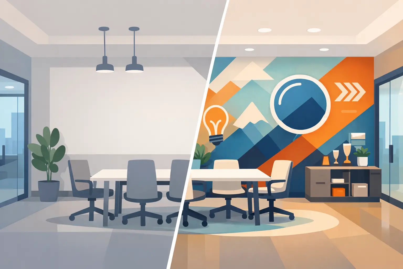
A lobby can tell people what kind of organization they have entered before anyone says hello. Yet many offices begin with the same challenge: painted walls, standard doors, and a logo tucked into a brochure or website. The most effective before-and-after office branding examples with custom lettering show how a few intentional words can turn that blank space into a clear expression of welcome, trust, and purpose.
Custom vinyl lettering does not require a full renovation to make a meaningful change. A mission statement behind a reception desk, calming words in a wellness waiting room, or core values in a staff hallway can give people an immediate sense of what matters there. Your wall, your message, designed around the people you serve.
What Changes When Office Branding Moves to the Walls
The “before” is not always unattractive. Often, it is simply generic. A clean lobby with no visible identity may look professional, but it can miss an opportunity to reassure a nervous patient, welcome a first-time visitor, or help a new employee understand the organization’s culture.
The “after” creates context. Branded lettering gives a reception area a focal point. It helps a hallway carry a message instead of feeling like a pass-through. It turns glass doors into useful wayfinding tools while keeping the space bright and open. The goal is not to cover every surface. It is to place the right words where people will naturally see and feel them.
For churches, schools, nonprofits, medical offices, and small businesses, the strongest results usually come from matching the message to the moment. Visitors need to know where they are and what to expect. Staff members need daily reminders of the values they put into practice. Supporters and donors should be able to see the impact and heart behind the work.
Before-and-After Office Branding Examples With Custom Lettering
A plain reception wall becomes a confident welcome
Before: The front desk is functional, but the wall behind it is empty. Guests check in without seeing the organization’s name, mission, or personality. This is common in growing offices that have invested in service and people but have not yet updated their surroundings.
After: A logo in custom vinyl lettering is centered behind the desk, paired with a short mission statement or welcoming phrase. The colors reflect the existing brand palette, and the lettering is sized to be readable from the entry point.
This approach works especially well for nonprofit offices, dental practices, counseling centers, and professional service businesses. It creates a polished first impression without requiring new furniture, construction, or a major redesign. If the wall has texture, paneling, or an unusual finish, material and installation choices matter. A design team can help determine whether vinyl lettering, a printed graphic, or another solution will give the cleanest result.
An empty staff hallway becomes a culture wall
Before: Employees walk through a neutral hallway every day. The space does its job, but it does not reinforce what the team is working toward together.
After: Core values, a purpose statement, or a series of short action-focused words are installed in a consistent visual style. Instead of being hidden in an employee handbook, the organization’s culture becomes part of the daily environment.
The difference is more than decorative. Thoughtful office branding can make values easier to remember during busy days and difficult decisions. A school may feature words such as “Learn, Lead, Serve.” A small business might display the principles that guide customer care. A ministry office may choose a meaningful scripture or a statement of mission that encourages staff and volunteers.
Keep the message concise enough to read while walking. A long paragraph can be meaningful, but it is not always the right fit for a hallway. In that case, select one key line for the wall and reserve the fuller story for another display or printed piece.
Glass doors become clear, welcoming wayfinding
Before: Conference rooms, counseling offices, classrooms, and treatment rooms have clear glass doors that provide little privacy or direction. Visitors may hesitate, knock on the wrong door, or feel unsure where to go.
After: Frosted or colored vinyl lettering identifies rooms, adds a logo or icon, and provides just enough visual separation. A wellness office may use soft, calming lettering on treatment room doors. A nonprofit can label meeting spaces with names that connect to its work. A church can guide guests toward children’s check-in, prayer rooms, or ministry offices.
Glass lettering has a practical side: it can improve navigation without blocking natural light. It also needs careful planning. Small text may be difficult to read through a busy lobby, while too much coverage can make glass feel closed off. The best designs balance privacy, visibility, and brand character.
A waiting room becomes a more reassuring experience
Before: A waiting area may have comfortable seating and a neat front counter, but little to ease uncertainty. This is particularly noticeable in medical, dental, therapy, and wellness settings, where people may arrive feeling rushed or anxious.
After: A gentle phrase, patient-centered promise, or simple brand message is placed on a feature wall. The lettering might be paired with a subtle printed graphic, natural colors, or a clean logo treatment. The room feels more intentional because the message speaks directly to the person sitting there.
For this kind of space, less is often more. One clear sentence has greater impact than a wall filled with slogans. Choose language that sounds like your real voice, not a generic promise. “We’re here to help you feel at ease” may fit one practice, while another may lead with its commitment to careful, compassionate care.
A donor or impact wall makes the mission visible
Before: A nonprofit’s accomplishments live in annual reports, emails, and conversations. Visitors may understand that the organization does good work, but they cannot immediately see the story of who has helped make it possible.
After: Donor recognition lettering, an impact statement, and carefully organized names create a permanent expression of gratitude. The display can also include milestone numbers, campaign themes, or a simple explanation of the community served.
A successful recognition wall needs room to grow. If names will be added over time, plan the spacing and hierarchy before production. Consider what should remain permanent, what may change annually, and how new names can be added without making the display feel crowded. Custom lettering makes this flexibility possible while keeping the presentation cohesive.
How to Plan an Office Branding Transformation
Start with one question: What should someone understand or feel in this space? The answer will guide the location, wording, scale, and style of your lettering. A lobby may need recognition and welcome. A break room may need encouragement. A glass entry may need simple directions and privacy.
Next, view the area from the perspective of the people using it. Stand at the entrance, at the reception desk, and in the seating area. Notice sightlines, lighting, wall texture, available width, and nearby colors. A phrase that looks perfect on a computer screen can feel too small or too high once it is on the wall.
Then, choose wording that can last. Brand names, core values, and mission statements are strong candidates because they are central to the organization. Seasonal campaigns and event-specific messages may be better suited for graphics designed to be changed more often.
Font choice also carries meaning. A refined script can feel personal and welcoming, while a clean sans serif may feel modern and direct. Readability should lead the decision, especially for directional signs, healthcare spaces, and any message viewed from a distance. Brand colors are valuable, but contrast matters just as much. Dark lettering on a light wall is often easier to read than a low-contrast design that disappears in changing light.
Small Details Create a Finished Look
The best “after” is not only about the words themselves. Alignment, spacing, and surface preparation shape how professional the final result feels. Measuring carefully, reviewing a proof at the right scale, and considering how lettering relates to furniture or architectural features can prevent avoidable disappointment.
This is where hands-on guidance makes a difference. Wall Words provides in-house design support and custom-made graphics, helping organizations move from an early idea to lettering that fits the actual space and reflects the message behind it. Whether the project is one lobby wall or a coordinated set of office graphics, careful planning helps the result feel like it has always belonged there.
A blank wall does not need more decoration. It needs the right message in the right place. When your office reflects your mission with clarity and care, every visitor, employee, patient, student, or supporter has a better starting point for connecting with what you do.