
Choosing Glass Privacy Graphics for Your Space
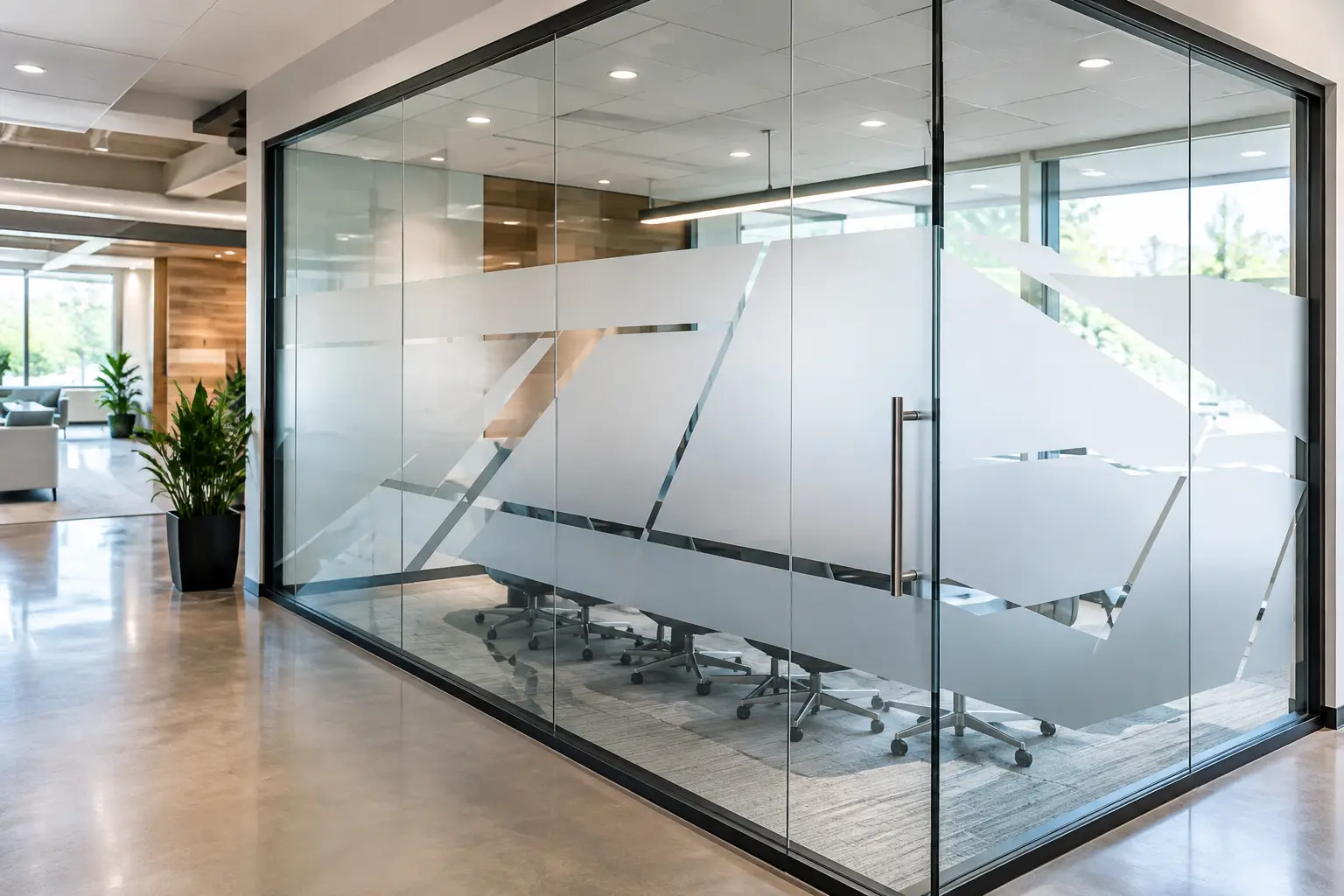
A glass door or window can make a room feel open and bright, but full visibility is not always what the space needs. Choosing glass privacy graphics gives you a way to keep the natural light while adding comfort, clarity, and a design that feels true to your organization. The right graphic can help a patient feel more at ease, give a staff meeting room needed discretion, or make a welcome area feel more intentional from the moment someone arrives.
Glass privacy graphics are not simply a practical fix for exposed windows. They are part of the experience you create for the people you serve. Before selecting a pattern, finish, or message, it helps to begin with one simple question: what do you want people to feel here?
Start With the Purpose of the Space
Privacy means different things in different rooms. A counseling office may need a high level of coverage so conversations and appointments feel protected. A church office might need privacy at eye level while still allowing staff to see if someone is at the door. A school conference room may need visual separation without making the room feel closed off.
Look at how the space is used throughout the day, not just how it looks when it is empty. Consider who passes by the glass, whether people sit close to it, and what can be seen from either side. A graphic that works beautifully on a hallway-facing office window may not provide enough coverage for a treatment room or private meeting space.
It also helps to think about the feeling you want to protect. In a medical or wellness office, the goal may be calm and discretion. In a nonprofit workspace, it may be focus and respect. In a school, the goal may be safety, belonging, and a clear sense of place. Your graphic can support all of those needs when the design begins with purpose.
Choosing Glass Privacy Graphics by Coverage Level
One of the first decisions is how much of the glass should be covered. There is no single right answer. The best choice depends on the room, the view, and the amount of daylight you want to keep.
Full coverage for sensitive or busy areas
Frosted or printed privacy film across most of a pane works well when a room needs strong visual separation. This is often a thoughtful choice for consultation rooms, staff areas, therapy offices, restrooms, and interior doors where people need to feel less exposed.
Full coverage does not have to feel plain. A subtle pattern, a soft fade, or a repeated element from your logo can bring warmth and personality to the glass. The key is to keep the design restful enough for the setting. In a space where people may already feel nervous or vulnerable, a quieter graphic often feels more caring than a bold, busy one.
Mid-level bands for privacy where it matters most
A frosted band placed across the center of a glass door or sidelights is a popular choice for offices, classrooms, and meeting spaces. It blocks the direct line of sight at eye level while leaving the upper and lower areas open to light.
This option is especially useful when you want a room to remain visible and connected to the rest of the building. You can add a department name, simple logo, room name, encouraging phrase, or wayfinding detail within the band. It is practical, but it can also make the space feel finished and easy to navigate.
Partial patterns for openness with gentle separation
Sometimes the goal is not full privacy. A pattern of dots, lines, leaves, or other shapes can soften a clear pane without completely closing it off. This approach works well in lobbies, reception areas, shared workspaces, and doors where light and visibility still matter.
Partial coverage is often a good fit for organizations that want a welcoming, open feel. Just remember that decorative coverage provides visual texture, not always true privacy. If people can still see clearly through the open areas, it may not be the right choice for a confidential setting.
Keep Light and Sightlines in Mind
Glass is valuable because it brings daylight into interior spaces. When selecting privacy graphics, pay attention to how much light reaches the room now and how the graphic may change that experience. Frosted vinyl usually lets in a generous amount of light while diffusing the view, which can help a room feel private without becoming dark.
Sightlines matter, too. Think about what staff members need to see for everyday awareness and what visitors should not be able to see. For example, a reception team may need a clear view into a hallway, while the people waiting nearby do not need a clear view of computer screens or private conversations.
Before approving a layout, stand where a visitor, patient, student, or team member would stand. Look through the glass from both sides. This small step can reveal whether a band should sit higher or lower, whether a pattern needs more density, or whether another section of glass needs coverage.
Let the Design Reflect Your Story
Privacy graphics can carry your identity in a quiet, meaningful way. A school may use its colors and mascot elements. A dental office may choose a clean, calming pattern with its logo. A ministry may incorporate a welcoming message or an understated design that reflects its mission. A small business may use branded shapes that make a front office feel more recognizable and personal.
The best designs do not force every detail onto the glass. Glass often looks strongest when the artwork has room to breathe. A simple logo, a short message, or a repeating pattern can say more than a crowded collection of text and images.
Color also deserves careful thought. White and etched-frosted looks are classic because they work with many interiors and keep the effect light. Brand colors can be a beautiful choice when they have enough contrast and fit the mood of the room. A bright, energetic color may feel right in a school hallway but too intense for a wellness office. It depends on the people in the space and the experience you hope to create.
Choose a Message That Helps, Not Just Decorates
When words are part of your glass graphic, keep them easy to read and useful to the person walking by. A door label such as “Counseling,” “Prayer Room,” “Conference Room,” or “Student Services” helps people know where they are welcome to go. A reception window might share a warm greeting, check-in instruction, or a brief reminder that someone is there to help.
For mission-based organizations, a few well-chosen words can make an ordinary doorway feel more connected to the work happening inside. A value like “Hope,” “Learn,” “Serve,” or “Belong” can be especially meaningful when it appears in the right place. The message should support the moment, not compete with it.
Avoid placing too much small text on glass, particularly where people are walking quickly. If a message needs more explanation, a nearby wall graphic may be a better home for it. Glass graphics are at their best when they are clear at a glance.
Plan for the Glass You Have
Not all windows and doors are alike. A large storefront pane, a narrow door sidelight, a set of French doors, and a glass partition each call for a different layout. Measurements, door handles, frames, existing decals, and nearby furniture all affect where a design can go.
If a door opens frequently, make sure the graphic does not interfere with visibility needed for safe movement. On exterior-facing glass, consider how sunlight and the view from outside may affect the design. Interior glass may call for a softer finish, while entry doors often benefit from clear, durable branding and wayfinding.
This is where a little guidance can save a lot of second-guessing. A custom design partner can help you review photos, measurements, and the purpose of the space before production begins. At Wall Words, that thoughtful, listen-first approach is part of helping each project feel right, not just look right.
Think Through Installation and Future Changes
A privacy graphic should fit your schedule as well as your space. If you are preparing for an opening, a renovation, or an event, allow time for design approval, production, and installation planning. Clean glass and careful placement make a noticeable difference in the finished look.
Consider whether your message may change in the future. Room names, staff areas, and seasonal campaigns may need updates over time, while a branded frosted pattern may be designed to stay in place for years. Choosing the right balance of permanent visual identity and flexible messaging can make future updates easier.
Bring together a photo of the glass, basic measurements, your logo or colors, and a few notes about the privacy you need. That is enough to begin a thoughtful conversation. The glass in your space can still feel open, bright, and welcoming while giving people the comfort of knowing that their presence, their work, and their privacy matter.