
Church Window Lettering Review and Buying Tips
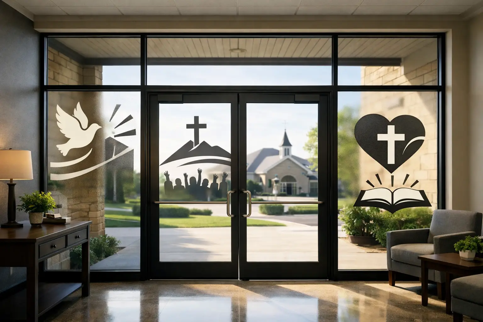
A church entrance starts speaking before anyone opens the door. The verse on the glass, the ministry hours by the front entry, the welcome message across a lobby window - those details quietly shape how people feel when they arrive. That is why a thoughtful church window lettering review matters. The right lettering can make your church feel clear, welcoming, and aligned with its mission. The wrong choice can fade into the background, peel too soon, or simply miss the tone you want to set.
If you are considering custom vinyl lettering for church doors, office windows, nursery check-in areas, or fellowship hall glass, it helps to review more than just appearance. Good window lettering is part design decision, part communication tool, and part practical signage. You want something beautiful, but you also need it to work in real life.
What makes church window lettering work
Church window lettering tends to do best when it balances warmth with readability. A lovely script font may feel inviting, but if guests cannot read service times from a few feet away, the design is not doing its job. In most church settings, clarity should lead and style should support it.
Placement matters just as much. Exterior entry doors often need basic information such as church name, office hours, or directional messaging. Interior glass can do something different. It can reinforce mission, share scripture, create privacy for offices or classrooms, or make children’s ministry and welcome areas feel more intentional.
This is where many churches benefit from thinking beyond decoration. Window lettering is often one of the most affordable ways to turn unused glass into something useful. It helps a space communicate with confidence without requiring a major renovation.
Church window lettering review: what to evaluate before you order
The most common mistake is choosing lettering based only on a mockup. A design can look great on screen and still be the wrong fit once sunlight, reflections, door frames, and viewing distance come into play. A better review looks at four practical areas: material, visibility, installation, and message.
Material and finish
Vinyl window lettering comes in several finishes, and each one changes the feel of the space. Standard opaque vinyl is crisp and easy to read, which makes it a strong choice for names, ministry labels, office identification, and hours. Frosted vinyl is softer and more subtle. It is often a better fit for church offices, counseling rooms, prayer rooms, and meeting spaces where privacy matters.
Neither option is universally better. It depends on the purpose of the glass. If the goal is high visibility from outside, opaque lettering usually performs better. If the goal is elegance and a little privacy, frosted often wins.
Durability matters too. Churches need graphics that can handle regular door use, cleaning, temperature changes, and sun exposure. Indoor glass generally gives you more flexibility. Exterior-facing windows need material chosen with more care, especially in bright or high-heat locations.
Visibility and readability
A strong church window lettering review should always ask one question first: can people read this quickly? Guests should not have to stop and study a door to figure out where to go.
Font choice has a huge impact here. Decorative fonts can be beautiful for a short scripture or a featured phrase, but directional information usually needs a cleaner style. Contrast matters too. Light lettering on bright glass may disappear during certain times of day. Dark lettering can feel bold and grounded, but may not suit every interior.
Size is another detail churches sometimes underestimate. Text that feels large on a proof may read much smaller once installed on a full-height door. If the message is important, it should be sized for the actual viewing distance, not for what looks balanced in a digital preview.
Installation realities
Some church window lettering projects are simple. A short phrase on one office door is usually straightforward. Larger installations across entry banks, classroom windows, or multiple ministry spaces require more planning.
This does not mean the project has to be difficult. It just means the design should match the installation setting. Long lines of text, intricate flourishes, and tightly spaced lettering can all be harder to apply cleanly. Churches with volunteers handling installation often do best with designs that are polished but practical.
A good provider should make this part easier with clear proofs, sizing support, and installation guidance. That support is often just as valuable as the lettering itself, especially for churches managing several spaces at once.
Message and tone
Window lettering is not only about what you say. It is also about how the space feels. A church entry may need to feel welcoming and easy to navigate. A prayer room may need to feel peaceful and reflective. A children’s wing may need energy and clarity for parents.
That is why the best wording is usually concise. Glass is not the place for long paragraphs. Short scriptures, simple ministry names, directional phrases, and brief mission-centered statements tend to work best. They create impact without overwhelming the space.
Best uses for church window lettering
Some of the most effective church applications are also the simplest. Front doors often benefit from clean identification, service times, or a warm welcome message. Interior offices can use frosted lettering for privacy and professionalism. Classroom and ministry spaces can use lettering to make navigation easier for families and guests.
Churches also use window graphics well in fellowship halls, donor recognition areas, and counseling spaces. In these areas, the lettering becomes part of the environment rather than just a label. It helps the building reflect the church’s identity in a visible, everyday way.
If your church has large unused glass panels, that can be an especially strong opportunity. Instead of leaving them blank, you can add scripture, values, or ministry messaging that brings purpose to the space.
Common trade-offs to think through
Not every church needs the same solution, and that is where a review becomes useful. Frosted lettering looks refined, but it may not stand out enough on all exterior windows. Bold white vinyl can be highly visible, but it may feel too strong in a quiet prayer area. A detailed custom design can be striking, but it may cost more and take more care during installation.
There is also the question of permanence. Some churches want long-term graphics that become part of the building experience. Others prefer flexible seasonal messaging for events, sermon series, or ministry campaigns. Both approaches can work. The key is knowing whether you are solving a lasting signage need or a short-term communication need.
Budget plays a role as well. Window lettering is often more affordable than many other interior upgrades, but pricing still varies based on size, complexity, color, and customization. If budget is tight, prioritize the windows that have the most visitor impact first. Entry points, welcome areas, and key ministry spaces usually offer the strongest return.
How to know you are choosing the right design
A good church window lettering project should feel like your church, not like a generic sign package. That means the wording, font style, scale, and finish should all support your mission and the way you serve people.
Start by asking what the glass needs to do. Should it welcome, direct, provide privacy, inspire, or reinforce identity? Once that answer is clear, the design choices become much easier.
It also helps to work from the visitor’s perspective. A staff member may already know where the nursery check-in desk is or which office belongs to pastoral care. A first-time guest does not. Window lettering works best when it removes uncertainty and adds warmth at the same time.
For churches that want a more custom result, design support can make a major difference. A thoughtful partner can help adjust spacing, scale, and material choices so the final piece works in the real space, not just in theory. That kind of guidance often turns a nice idea into something that genuinely strengthens the environment.
Wall Words often sees this firsthand with churches that want their spaces to communicate clearly without losing heart. The most successful projects are rarely the busiest. They are the ones where every word has a reason for being there.
A final word on value
The best part of window lettering is that it can change the feel of a church in a very immediate way. You do not need construction dust, major downtime, or a full remodel to make a glass entrance feel more welcoming or a ministry hallway feel more intentional. With the right design, even a simple phrase can bring clarity, comfort, and purpose to a space people walk through every day.
If you are reviewing options right now, trust the practical questions as much as the visual ones. When lettering is easy to read, thoughtfully placed, and true to your church’s identity, it does more than decorate a window. It helps your building say what matters before a single greeting is spoken.