
Community Space Branding Trends That Build Belonging
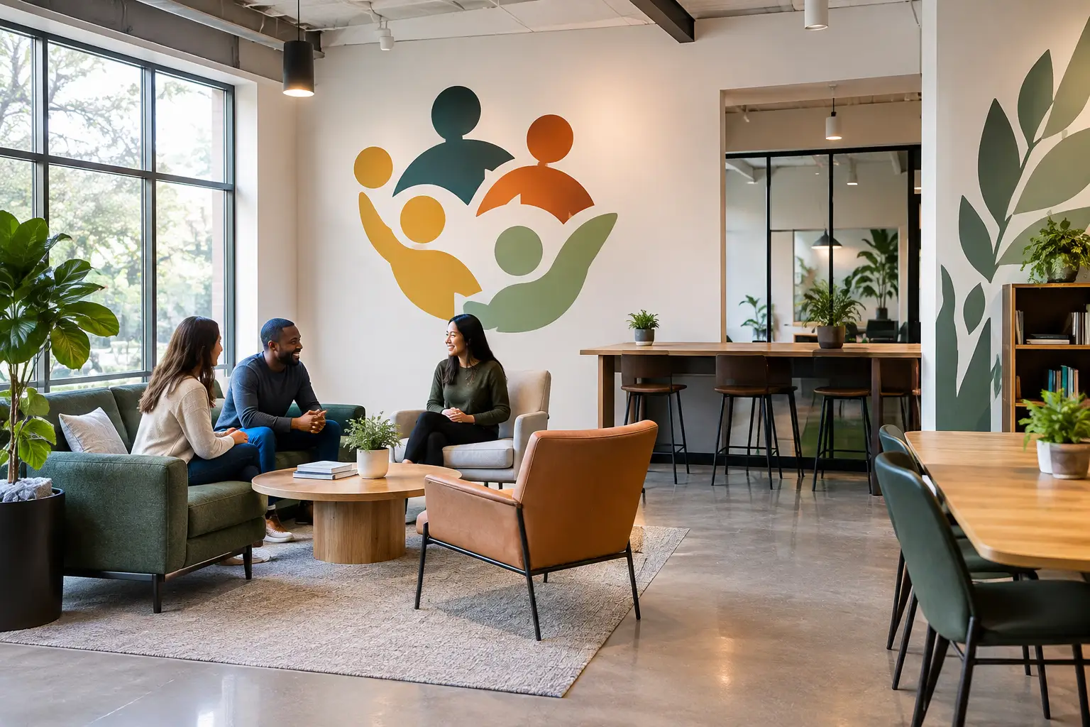
A lobby wall can answer a question before anyone reaches the front desk: Am I in the right place? Do these people see me? Does this space reflect what they care about? That is why community space branding trends are moving beyond logos alone. Organizations are using walls, windows, and shared spaces to make their purpose visible in ways people can feel.
For a school, that may mean a hallway that celebrates belonging and growth. For a nonprofit, it may be a donor wall that honors generosity while helping visitors understand the mission. For a church, a warm welcome and a meaningful scripture can set the tone before a service begins. The best trends are not about chasing a certain look. They are about creating spaces that feel true to the people who gather there.
Community Space Branding Trends Are Becoming More Personal
For years, many shared spaces followed the same formula: a logo at reception, a few framed photos, and blank walls everywhere else. That approach can be clean, but it often misses an opportunity. The walls people pass every day can carry encouragement, guidance, gratitude, and a sense of identity.
Today, organizations are choosing messages that sound like them. Instead of a generic statement about excellence, a medical office might share a simple promise of compassionate care. A small business may feature the values its team lives out each day. A community center might use a welcome message in the exact language its neighbors use with one another.
This shift matters because people recognize the difference between words chosen to fill space and words chosen with care. Personal branding does not mean covering every wall with text. It means selecting the right message for the right moment, then giving it room to be noticed.
Mission statements are moving out of the conference room
A mission statement should not have to live in a binder or on a hidden page of a website. More organizations are bringing their mission into entryways, gathering rooms, hallways, and team spaces where it can do its real work: remind people why they are there.
The strongest mission walls are easy to read from a natural viewing distance. They use a clear typeface, thoughtful spacing, and a size that fits the wall rather than forcing every word into one crowded block. A short phrase can sometimes carry more weight than the full statement, especially in a busy lobby. The longer version may belong in a meeting room where staff and volunteers can spend time with it.
That is one of the most helpful trade-offs to consider. A wall does not need to say everything. It needs to say the most meaningful thing well.
Warm Welcome Moments Matter More Than Ever
Community spaces serve people who may be arriving with questions, nerves, hope, or a full day already on their shoulders. A welcome wall can help soften that first moment. This is especially meaningful in healthcare offices, ministries, schools, and nonprofit spaces where visitors may be new or uncertain about what comes next.
Current design choices lean toward warmer, more human language. Rather than a formal "Reception," an office might say, "We’re glad you’re here." A school entrance may pair its name and colors with a reminder that every student belongs. A waiting room can share a calming thought that feels supportive without competing for attention.
The message should match the setting. A cheerful phrase may fit a children’s dental office, while a wellness practice may need quieter words and softer visual contrast. The goal is not to make every room look alike. It is to help each person feel considered when they walk in.
Branded wayfinding is becoming friendlier
Directional signs are often treated as purely functional, but they can be part of the experience too. Clear vinyl lettering on doors, windows, and walls helps people find restrooms, classrooms, check-in areas, prayer rooms, or offices without having to ask.
The trend is toward wayfinding that feels consistent with the organization’s personality. A school can use its colors and mascot details. A nonprofit can use a simple icon system and a hopeful, welcoming voice. A professional office may choose clean lettering with subtle color accents that match its existing brand.
Function comes first here. If visitors cannot read it quickly, even the prettiest sign has missed the mark. Contrast, placement, and letter size deserve just as much attention as color and style.
Donor Recognition Is Becoming Part of the Story
Donor walls continue to change from static lists of names into thoughtful expressions of gratitude. Names still matter deeply, but organizations are finding ways to connect recognition with the impact those gifts make possible.
A community organization might pair donor names with a short message about the families, students, or neighbors their generosity supports. A school could recognize founding families alongside a visual timeline of growth. A ministry may create a giving wall that expresses gratitude with humility and care.
Flexibility is a valuable part of this trend. Vinyl lettering and dimensional-style printed graphics can make it easier to add names, update categories, or refresh a display as a campaign grows. Before choosing a design, consider how often it will need to change. A permanent-looking display may be right for a long-term legacy wall, while a more adaptable format can serve an annual campaign better.
Local Character Is Showing Up in Shared Spaces
People connect with spaces that feel rooted in their community. That does not require a mural on every wall or a complete renovation. A few well-chosen visual details can tell a story about place, history, and the people an organization serves.
A neighborhood business may include a short line about its founding values near the entrance. A school might use student artwork, school colors, and words that reflect its culture. A nonprofit may share a visual map of the area it serves. These details give people something familiar to recognize and something meaningful to talk about.
The key is authenticity. Borrowing a style because it is popular can make a space feel disconnected from its own story. Start with the organization’s real voice, its people, and the feeling it wants visitors to carry with them.
Less Clutter, More Intention
One of the most practical community space branding trends is a move away from visual overload. Shared spaces often collect posters, old notices, temporary signs, and messages from different years. Each piece may have been useful at one time, but together they can make it hard for people to know where to look.
A thoughtful refresh starts by identifying the walls that matter most: the first wall visitors see, the place where people wait, the hallway everyone uses, or the room where teams gather. Then decide what each wall needs to do. Welcome? Guide? Encourage? Honor? Inform?
Once the purpose is clear, design gets easier. A large, custom wall quote may be the right choice for a staff room. Window decals can bring privacy and identity to an office entrance. A focused logo display can establish a professional first impression. Not every surface needs graphics, and the open space around a message often helps it feel more important.
Custom details make a design feel finished
Color, font, scale, and placement all shape how a message is received. A phrase that feels encouraging in a handwritten-style font may feel more formal in a clean sans serif. A bright color can bring energy to a school hallway but may be too strong for a calming care environment.
This is where samples and guidance can save time. Seeing vinyl colors against the actual wall color, checking a font at full scale, and talking through installation details can prevent a good idea from becoming a frustrating project. For busy leaders, having a partner who listens first can make the process feel much more manageable.
Your wall, your designs, and your story deserve that kind of attention. At Wall Words, custom vinyl lettering, decals, and printed wall graphics are created to help organizations share what matters with clarity and heart.
The most lasting spaces do not try to impress everyone. They help the right people feel welcomed, understood, and connected. Start with the message your community needs to see, and let the walls help carry it forward.