
Company Logo Vinyl Lettering for Walls That Welcome
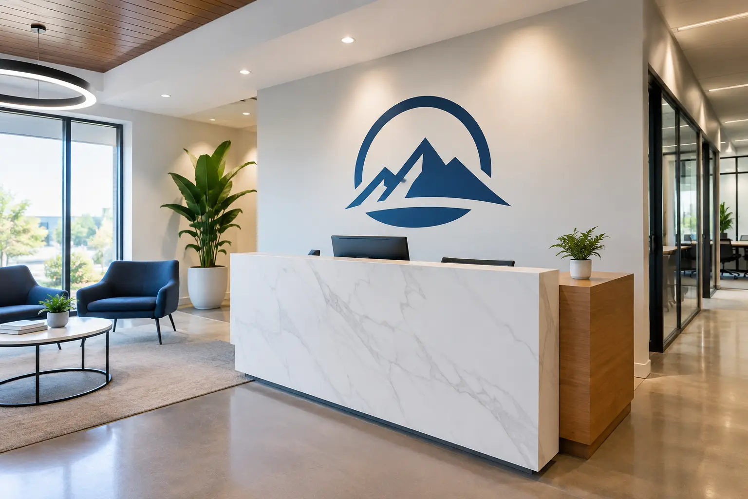
The first few seconds inside your door matter. A blank reception wall can leave visitors wondering where to go or what your organization stands for. Company logo vinyl lettering for walls gives that moment a clear, welcoming voice - one that says, “You’re in the right place.”
For a small business, school, nonprofit, church, medical office, or growing team, your logo is more than a graphic. It represents the work you do, the people you serve, and the care you bring to your community. Placing it thoughtfully on a wall can make your space feel more connected to that purpose.
Why Company Logo Vinyl Lettering for Walls Matters
A logo wall helps people quickly understand who they are visiting. In an office lobby, it creates a polished first impression without making the room feel cold or overly formal. In a school or ministry space, it can build familiarity and belonging. In a wellness practice, it can offer a calm, reassuring point of reference before a patient ever speaks with the front desk.
The effect is not only for visitors. Employees pass that wall every day. When the logo sits alongside a short mission statement, a meaningful phrase, or a set of core values, it can become a simple reminder of why their work matters. The best designs do not just fill an empty wall. They help people feel connected to the story unfolding there.
Vinyl lettering is especially useful when you want a custom look without the visual weight of a large, permanent sign. Individual letters and logo elements create a clean, painted-on appearance. They are a natural fit for smooth interior walls, glass entry doors, conference rooms, hallways, reception areas, and staff spaces.
Start With the Feeling You Want to Create
Before choosing a font, color, or wall size, consider what you want someone to feel when they arrive. A family dental practice may want its reception area to feel friendly and dependable. A nonprofit may want visitors to immediately see the heart behind its work. A business with a close-knit team may want its office to reflect confidence, creativity, and pride.
That feeling should guide the design. A clean logo in brand colors may be all a busy lobby needs. Another organization may choose a logo paired with a short line such as “Serving Our Community With Care” or “Growing Together.” The words should support the logo, not compete with it.
This is where taking a little time upfront pays off. It is easy to focus only on what will look good in a product preview. It is more helpful to ask what will feel right in the room, from the doorway and from the places where people naturally pause.
Choose the right wall
Your logo deserves room to breathe. A reception wall behind a front desk is a familiar choice because it is often the first surface people see. But a side wall near a waiting area, an entrance hallway, or a conference room can be just as meaningful when it fits the way people move through the space.
Look for a wall that is smooth, clean, dry, and visible without being crowded by furniture, doorways, switches, or framed items. Textured surfaces can make vinyl harder to apply evenly, so it helps to share details or photos of your wall before ordering. A little planning can prevent the frustration of realizing the best-looking layout does not fit the actual space.
Get the scale right
Size changes everything. A logo that looks balanced on a computer screen can feel too small once it is placed on a wide lobby wall. On the other hand, an oversized design can make a smaller room feel busy.
Measure the full wall, then measure the open area where the design will sit. Consider the viewing distance as well. A logo seen from across a reception area needs more presence than one viewed from a few feet away in a hallway. If your logo includes fine lines, small type, or detailed artwork, enlarging it may also make it easier to read and appreciate.
A helpful rule is to design for the room, not just the available surface. Empty space around the logo is not wasted space. It gives the design a sense of intention.
Color, Fonts, and Materials That Feel Like Your Brand
Your company colors should feel recognizable in the finished lettering, but they also need enough contrast against the wall. Dark lettering on a light wall is usually easy to read. White lettering can look striking on a deep accent wall, glass door, or painted feature wall. Similar tones may feel subtle and sophisticated, but they can disappear from a distance.
If you are unsure, a color sample can be especially helpful. Lighting shifts throughout the day, and colors often look different under warm interior bulbs than they do in daylight. Seeing a sample in your own room can make the decision feel much easier.
For most logo projects, it is best to use the fonts already built into your brand artwork. If you are adding a tagline, mission statement, or directional message, choose a complementary font that remains easy to read. Script lettering can bring warmth and personality, while simple sans serif lettering often feels clean and modern. The right choice depends on your logo, your audience, and the mood of the room.
Matte vinyl is a popular option for interior walls because it has a soft, painted look with minimal shine. Glossy finishes can bring more visual pop, especially on windows or smooth painted surfaces. Printed wall graphics may be a better fit when your logo includes multiple colors, gradients, illustrations, or details that would be difficult to create with separate cut vinyl pieces.
Make Installation Feel Manageable
Many organizations choose vinyl lettering because it offers a custom result without turning the project into a renovation. Still, installation deserves care. The wall should be fully cured if it was recently painted, clean of dust and oils, and dry before application. Rushing this step can affect adhesion.
Larger designs are easier to handle with two people. One person can hold the graphic in position while the other checks the level and follows the installation instructions. For a lobby logo or a detailed multi-piece design, use the supplied layout guides and take your time. A few extra minutes spent checking placement is worth it.
If your team is already balancing events, staff needs, visitors, and a long to-do list, you do not have to figure out every design choice alone. Wall Words takes a White Glove approach, listening to your vision and helping you think through artwork, sizing, color, and the details that make the finished piece feel right for your space.
Pair Your Logo With a Message That Means Something
A logo can stand on its own, but it can also open the door to a fuller story. Consider what visitors, clients, students, patients, donors, or team members need to know when they walk in. A carefully chosen message nearby can make your identity clearer and your welcome more personal.
A nonprofit might place its logo above a sentence about the lives it serves. A school may add a statement of belonging near its mascot or seal. A company could feature its logo in the lobby, then carry its core values into a conference room or staff hallway. These pieces do not need to say everything at once. They simply need to say what matters most.
When your wall reflects the heart behind your work, people notice. They may not remember every word, but they will remember how the space made them feel - welcomed, encouraged, cared for, and connected to something meaningful.