
Custom Wall Graphics Buying Guide
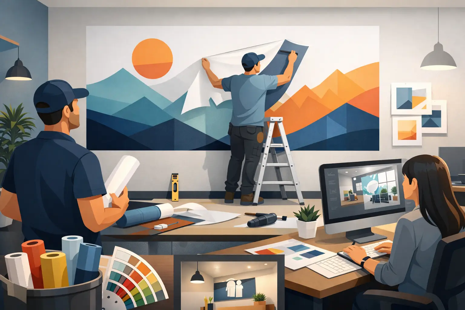
A blank wall can say more than people realize. In a church lobby, it can set the tone before a word is spoken. In a nonprofit office, it can remind staff and donors why the work matters. In a school, clinic, or small business, it can turn an ordinary room into a space that feels clear, welcoming, and intentional. That is why a custom wall graphics buying guide is not just about picking a decal or choosing a font. It is about making sure your space reflects who you are and what you want people to feel.
The best custom graphics do two jobs at once. They look polished, and they communicate something meaningful. When those two things come together, your environment starts working for you every day.
How to use this custom wall graphics buying guide
If you are shopping for custom wall graphics for the first time, it helps to think beyond the artwork itself. The right choice depends on where the graphic will go, who will see it, how long it needs to last, and what message it should reinforce.
A mission statement in a staff workspace has a different purpose than donor recognition in a hallway or privacy graphics on office glass. The design approach, material, and scale should support that purpose. Buying well starts with clarity. Before you compare sizes, colors, or pricing, ask what the wall needs to accomplish.
For some organizations, the goal is inspiration. For others, it is branding, wayfinding, recognition, or creating a more professional atmosphere. Many spaces need a mix of all four. That is where custom work matters. Your wall, your designs, your message.
Start with the message, not the material
It is tempting to begin by browsing styles, finishes, or popular layouts. But the stronger starting point is the message itself. What should people understand within the first few seconds of seeing the wall?
In a nonprofit setting, that might be a concise mission statement paired with a visual mark. In a wellness office, it may be reassuring language that helps patients feel at ease. In a school, core values or motivational phrases often work best when they are short, easy to read, and placed where students naturally gather.
If the wording is too long, even a beautiful graphic can feel crowded. If it is too vague, the wall may look nice without doing much. A good rule is to prioritize clarity over quantity. One strong statement usually carries more weight than a wall filled with too many competing ideas.
This is also the stage where design support makes a difference. If you have a clear concept, great. If you only have a rough idea, that is okay too. A thoughtful design process can turn a simple phrase, logo, or vision into something that feels finished and purpose-driven.
Choose the right type of wall graphic
Not all custom wall graphics are built the same, and choosing the right format can save time, money, and frustration.
Vinyl lettering is ideal when the words themselves are the focus. It gives a clean, painted-on look and works especially well for mission statements, scripture, office values, business hours, and quotes. Printed graphics are better when your design includes logos, illustrations, gradients, photos, or brand elements that need more color detail.
Wall decals can range from simple icons to large branded installations. They are often a smart choice when you want flexibility in shape and layout. Glass graphics are another category worth considering if you want privacy, branding, or a polished entryway without changing the whole room.
The right option depends on the design. If your artwork is mostly text, cut vinyl may be the most efficient path. If your concept relies on layered visuals or full-color branding, printed graphics usually make more sense.
Size changes everything
A common mistake is choosing a graphic that is too small for the wall. On a product page or proof, the design may look substantial. Once installed on a wide lobby wall or tall office entry, it can suddenly feel undersized.
Scale affects both visual impact and readability. A donor wall in a reception area needs to be large enough to feel significant. A core values display in a conference room should be readable from across the space. Smaller graphics can still work beautifully, but they need to suit the architecture around them.
Take real measurements before you order. Width and height matter, but so do ceiling height, furniture placement, and viewing distance. A wall graphic does not live in isolation. It shares the room with desks, doors, windows, seating, and lighting.
If you are unsure, painter's tape is a helpful planning tool. Mark out the proposed size directly on the wall and step back. You will get a much better sense of proportion than you would from numbers alone.
Think about surface and placement
The best design can still fail if the wall surface is wrong for the material. Texture, paint condition, and location all matter.
Smooth, clean walls tend to be the most installation-friendly. Heavily textured walls can be more challenging, especially for fine lettering or intricate details. Freshly painted surfaces may also need time to cure before graphics are applied. If a graphic is going on glass, placement becomes even more important because lighting and transparency affect how the finished piece will look.
This is one of those areas where it depends. A hallway wall with light texture may still work well with the right product. A rough cinderblock surface may call for a different solution entirely. If the wall is in a high-touch or high-traffic area, durability should also be part of the decision.
When buying custom graphics, surface details are not a minor technicality. They are part of getting a result that lasts.
Color, font, and finish should fit the room
Color samples and font choices are not just decorative extras. They shape how professional, welcoming, calm, bold, or inspiring the space feels.
For schools and nonprofits, high-contrast colors often improve readability and presence. For medical and wellness spaces, softer palettes may support a more calming environment. For business interiors, the best choice is often brand-aligned color used with restraint so the room feels polished rather than busy.
Fonts deserve the same care. A script style may feel personal and warm, but it is not always the most readable at a distance. A clean sans serif may feel modern and clear, but it can also feel too plain if the message needs more personality. The right answer depends on your audience and your wall's purpose.
Finish matters too. Matte often gives a more refined, painted look, while glossier finishes can make colors pop. Neither is automatically better. It comes down to lighting, style, and the kind of presence you want the graphic to have in the room.
Installation should feel manageable
For many buyers, installation is where hesitation starts. That is understandable. Even a well-designed graphic can feel intimidating if you are worried about alignment, bubbles, or placement.
The good news is that many custom wall graphics are designed for straightforward installation, especially when they come with clear instructions and sizing planned well from the start. Simpler text-based layouts are often easier for in-house teams to apply. Larger or more detailed graphics may take more patience and a second set of hands.
If your project includes a prominent lobby wall, a multi-piece layout, or a large glass installation, it is wise to factor installation into your buying decision early. Convenience matters just as much as appearance. A slightly simpler design that installs cleanly can be the better investment than a more complex option that creates stress.
Pricing is about more than square footage
Most buyers want a starting price, and that makes sense. But with custom work, cost is shaped by more than size alone.
Material type, color count, design complexity, production method, and installation layout can all affect pricing. A single-color quote in vinyl lettering may be more budget-friendly than a large full-color printed wall graphic. A simple logo on glass will price differently than a full donor recognition display with multiple names and custom spacing.
That does not mean custom has to mean complicated. It simply means the best value comes from matching the product to the need. If your goal is long-term visibility and daily impact, a well-planned wall graphic often does more for a space than temporary signage or generic decor.
Fast printing and responsive support also matter. When you are coordinating an office refresh, school update, church event, or clinic opening, timing becomes part of the value.
What to look for before you buy
A strong custom wall graphics buying guide should leave you with confidence, not more confusion. Before placing an order, make sure you can clearly answer a few practical questions. What message belongs on the wall? What are the exact dimensions? What surface is it going on? How readable will it be from normal viewing distance? Do the colors and fonts fit the room? And does the installation plan feel realistic?
If any of those answers feel fuzzy, it is worth slowing down. The right partner will help you think through the details, offer design guidance, and make the process feel simple rather than overwhelming. That kind of support is often what separates a graphic that merely fills space from one that truly strengthens it.
When your environment reflects your mission clearly, people feel it. They understand where they are, what you value, and why your work matters. Start there, and the right wall graphic becomes much easier to choose.