
How to Apply Office Glass Graphics Well
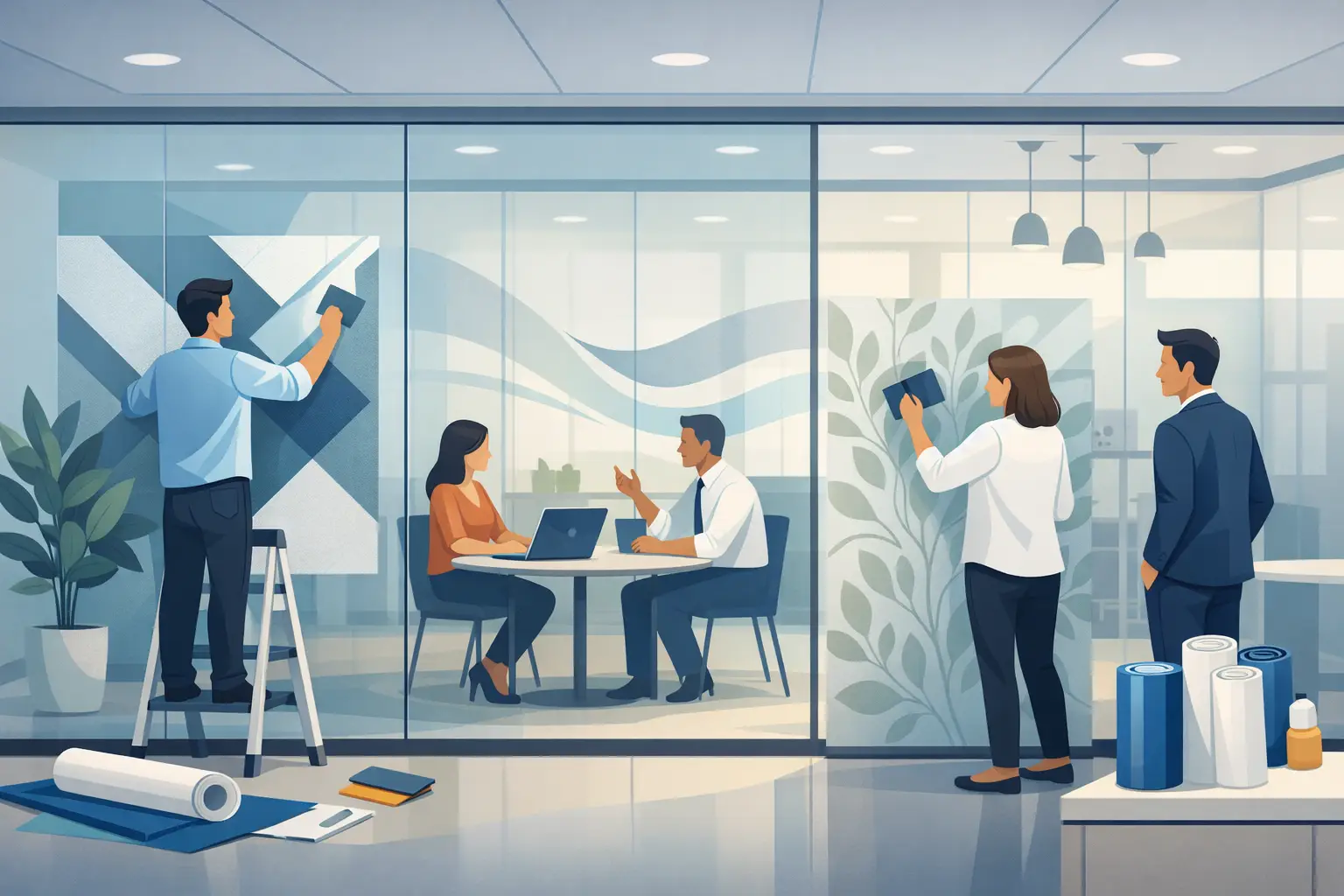
A blank glass wall can make an office feel polished, but it can also feel cold, exposed, or unfinished. When you apply office glass graphics with intention, that same surface starts working harder for your team. It can add privacy without shutting people in, reinforce your brand without feeling loud, and turn a pass-through space into something people actually notice.
For schools, nonprofits, clinics, churches, and small businesses, glass graphics are often one of the fastest ways to improve a space without construction. The key is not just choosing a design you like. It is choosing the right message, material, scale, and installation approach so the final result feels clean, professional, and worth the investment.
Why office glass graphics do more than decorate
Glass is one of the first surfaces people encounter in a lobby, conference room, waiting area, or entry. That makes it valuable visual real estate. A logo on a front door, frosted privacy film on a conference room, or mission-based message across an interior glass panel can shape what people feel before a single conversation starts.
This matters in practical ways. Patients feel more at ease when a wellness office feels private and calm. Staff members feel more connected when a workplace reflects shared values. Visitors understand where they are and what an organization stands for when the environment communicates clearly.
Good glass graphics also solve specific problems. They can reduce distraction, create modest privacy, improve wayfinding, and add safety by making large glass panels more visible. That mix of function and meaning is what makes them such a smart choice.
Before you apply office glass graphics, start with purpose
The most successful projects begin with one simple question: what should this glass do?
In some offices, the goal is privacy. In others, it is branding, donor recognition, directional messaging, or creating a more welcoming experience. A school may want cheerful visuals that support identity and visibility. A medical office may need a softer look that feels clean and reassuring. A nonprofit may want glass that communicates mission without overwhelming the room.
That purpose should guide every design decision. If privacy matters most, frosted or etched-look vinyl often makes more sense than a full-color print. If visibility from a distance is the priority, bold shapes and clean lettering will perform better than delicate details. If the glass is part of a larger interior branding plan, the graphics should feel connected to wall messaging, color choices, and the tone of the organization.
This is where custom work makes a real difference. Pre-made graphics can be quick, but they rarely account for your architecture, your audience, or the message your space needs to carry.
Choosing the right type of glass graphic
Not every office glass graphic is trying to do the same job, so the material matters.
Frosted vinyl is one of the most popular options because it gives a clean, professional look and adds privacy without blocking light. It works especially well for conference rooms, office dividers, wellness spaces, counseling offices, and reception areas.
Cut vinyl lettering is ideal when the message itself is the focus. Think office hours, values statements, room names, or simple branding on doors and sidelights. It has a crisp look and works best when readability matters more than coverage.
Printed graphics offer more flexibility with color, gradients, logos, and imagery. They can feel more expressive and brand-forward, but they require careful design. Too much detail on glass can quickly feel cluttered, especially in smaller spaces.
Perforated or specialty films may also have a place, but they depend on the application. The right answer is often a balance between appearance, privacy, budget, and how permanent you want the installation to be.
Design decisions that make the finished result look professional
When people think a glass graphic looks expensive, they usually mean it looks intentional. That comes from proportion, placement, and restraint.
Start with scale. Graphics that are too small can feel like an afterthought. Graphics that are too large can overwhelm the glass and the room around it. A conference room band across the middle of the glass should align with sightlines and furniture placement. A logo on an entry door should be sized to read clearly without taking over the whole pane.
Next, think about opacity and density. Full coverage can be beautiful, but partial coverage often feels lighter and more refined. A frosted band, repeating pattern, or selective blocking can offer privacy while still allowing the room to breathe.
Typography matters too. Thin fonts, long paragraphs, and tiny details are harder to read on glass than they seem on a screen proof. Clean lines almost always win. If the message is meaningful, give it enough space to be read comfortably.
And then there is consistency. If your office uses wall quotes, branded colors, room names, and directional signage, the glass graphics should feel like part of the same family. A space feels stronger when every surface speaks the same visual language.
How to apply office glass graphics cleanly
Installation is where a great design can either shine or fall short. Even a well-designed graphic will not look polished if it is crooked, bubbling, or poorly placed.
The glass needs to be thoroughly cleaned first. Dust, fingerprints, and residue can interfere with adhesion and show through the finished product. This step takes patience, especially near edges and corners where buildup is easy to miss.
Positioning comes next. Before anything is permanently applied, the graphic should be measured and taped in place to confirm height, alignment, and spacing. This is especially important on double doors, sidelights, and multi-panel installations where even a small shift becomes obvious.
Application method depends on the material. Some vinyl graphics are installed dry, while others benefit from a wet method that allows repositioning. Larger graphics usually require more care and a steady hand to prevent wrinkles or trapped air. A squeegee, proper pressure, and working slowly from one side to the other all help create a smooth finish.
There is a reason many organizations choose professional help for larger or more visible installations. Front entry doors, conference rooms, donor displays, and branded interior glass all sit in high-traffic areas where imperfections are easy to spot. If the project is complex, oversized, or central to your brand presentation, expert installation often saves time and prevents expensive rework.
Common mistakes to avoid
The biggest mistake is treating office glass like a blank page instead of part of a real environment. Glass interacts with light, reflections, furniture, and movement. A design that looks balanced on screen may look busy once sunlight hits it or people start moving behind it.
Another common issue is choosing graphics based only on appearance without thinking about daily use. A conference room may need privacy while still allowing staff to see whether the room is occupied. A front door may need branding, but it also needs safety visibility. A clinic may want calming graphics, but not so much coverage that the space feels closed off.
It is also easy to underestimate installation. Smaller decals can be manageable for confident DIYers, but larger glass graphics require accuracy. Misalignment by even half an inch can make a professional office look unfinished.
Where glass graphics work best in an office
Some of the strongest applications are also the simplest. Entry doors are ideal for logos, names, suite numbers, and welcome messaging. Conference rooms benefit from frosted bands, privacy panels, or branded patterns. Interior office fronts can carry names, titles, or values-based language that supports culture without overwhelming the space.
Waiting areas and wellness environments often benefit from softer privacy graphics that reduce the clinical feel of open glass. In schools and nonprofits, interior glass can be used to highlight mission statements, donor recognition, or uplifting messages that remind people why the work matters.
The best placements are usually the ones people interact with every day. Those repeated visual moments are what build familiarity, trust, and connection over time.
A thoughtful process leads to better results
If you are planning to apply office glass graphics, think beyond the product itself. Consider what people should feel when they walk in, what your staff needs from the space, and what message deserves to be visible every day.
That is often where the process becomes easier. Once the purpose is clear, the right design choices tend to follow. You do not need more decoration. You need graphics that fit your space, support your work, and reflect who you are with clarity.
A well-designed office does not have to be complicated to be meaningful. Sometimes the right words on the right piece of glass are enough to change how a space feels the moment someone steps inside.