
How to Design Scripture Wall Lettering
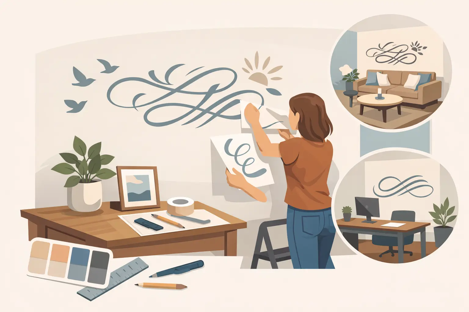
A blank wall can either disappear into the background or quietly shape how people feel the moment they enter a room. When you design scripture wall lettering with care, that wall starts doing meaningful work. It can welcome, comfort, refocus, or remind people why they are there in the first place.
That is what makes scripture lettering different from ordinary decor. The words matter, but so does the way they are presented. A verse set too small gets lost. A beautiful font used in the wrong room becomes hard to read. A strong message placed in the right location, at the right scale, can become part of the daily experience of a church lobby, classroom, counseling office, prayer room, or family space.
Why design matters as much as the verse
Most people begin with the scripture itself, and that makes sense. The message comes first. But once you move from inspiration to installation, design decisions start shaping how that message is received.
A short verse in an elegant script can feel peaceful and reflective. The same words in a bold, clean typeface can feel confident and directive. Neither approach is automatically better. It depends on the room, the audience, and what the space is meant to communicate.
This is especially true in shared environments. A worship space may call for something reverent and spacious. A children’s ministry hallway may need lettering that feels warm, uplifting, and easy to read at a glance. A counseling office might need a scripture that supports calm without overwhelming the room. Good design helps the message land the way you intend.
Start with the purpose of the room
Before choosing fonts or colors, look at the role the space plays. Is this wall meant to inspire people in passing, encourage them while they wait, or create a focal point for deeper reflection? That answer changes everything.
In an entryway, scripture wall lettering often works best when it is concise and instantly readable. People are moving, greeting one another, and taking in the environment quickly. A shorter verse or key phrase usually carries more impact there than a long passage with smaller text.
In a sanctuary, chapel, or prayer room, you may have more flexibility. People spend longer periods in those spaces, so slightly more detailed lettering can work well if the layout remains balanced. In offices, schools, and wellness spaces, clarity usually matters most. The design should support the atmosphere, not compete with it.
Design scripture wall lettering for readability first
The most beautiful layout in the world will not succeed if people have to strain to read it. Readability is where practical design earns its place.
Font selection matters more than many people expect. Script fonts can be lovely for a featured word, a short verse, or part of a composition, but long passages in highly decorative script often become difficult to read from a distance. Clean serif and sans serif fonts are easier for larger scripture blocks, especially in public spaces where viewers are standing at different angles.
Size also plays a major role. A common mistake is trying to fit too many words into too little wall space. If the message becomes tiny to accommodate the full passage, the wall loses its impact. Sometimes the better choice is to use a key verse reference with the main phrase, or select a shorter excerpt that captures the heart of the message.
Line spacing, letter spacing, and layout deserve attention too. Crowded text feels visually stressful, even when the verse itself is comforting. Giving the words room to breathe helps people absorb them naturally.
Choosing the right style for your environment
There is no single correct look for scripture lettering. A design that feels exactly right in one setting can feel out of place in another. That is why customization matters.
If your interior style is modern, clean lettering with simple spacing may feel most natural. If the room has traditional architectural details, a classic serif font may create better harmony. Rustic interiors often pair well with mixed-font designs that combine warmth with structure. Contemporary ministry spaces may lean toward minimal layouts with stronger scale and fewer decorative elements.
Color should support contrast and mood. Dark lettering on a light wall is usually the easiest to read. Tone-on-tone designs can look sophisticated, but they depend heavily on lighting and placement. In a bright room with strong natural light, subtle contrast may still work. In dimmer spaces, higher contrast is usually the safer choice.
This is one of those areas where it depends. The most visually dramatic option is not always the most effective. The best style is the one that feels true to the room and easy for people to engage with.
Placement can make or break the final result
Even a strong design loses power when placed too high, too low, or in visual competition with everything around it. The wall itself is only part of the equation. You also need to think about furniture, traffic flow, windows, lighting, and sightlines.
A verse above a reception desk can create an immediate first impression. Scripture along a hallway can reinforce mission and encouragement throughout the day. A large focal wall behind a seating area can anchor the tone of the entire room. In children’s spaces, lower placement may help young readers connect with the message more directly.
It also helps to step back and think about what people will see first. If the wall already includes artwork, signage, donor recognition, or branding, scripture lettering should work with those elements instead of fighting for attention. Sometimes a simpler layout is stronger because the room already carries plenty of visual information.
When to keep it simple and when to add graphic elements
Some scripture walls look best as pure typography. Others benefit from a border, a subtle flourish, or a small visual accent that supports the message. The key is restraint.
If the verse is already emotionally strong, heavy decoration can dilute it. A clean presentation often feels more timeless and more versatile across changing interiors. On the other hand, certain spaces benefit from a more expressive design. A children’s area, women’s ministry room, or creative classroom may feel more welcoming with a thoughtful graphic touch.
The question to ask is whether the extra design element helps people notice and remember the message, or whether it simply adds noise. If it is the second one, leave it out.
Custom design creates a better fit
Pre-made wall quotes can be helpful for inspiration, but custom design tends to deliver a much better result when the space has a specific purpose. That is especially true for churches, schools, nonprofits, and offices where the wall is part of a larger mission-driven environment.
Custom scripture wall lettering lets you adjust scale, font pairing, layout, and color to fit the exact wall rather than forcing the wall to fit a standard design. It also gives you room to reflect your organization’s identity. A faith-based school may want scripture that feels encouraging and youthful. A church foyer may need something more welcoming and foundational. A counseling center may want a verse that feels peaceful without being visually busy.
This is where hands-on design support makes a real difference. Many customers know the message they want to share but are unsure how to translate it into a finished wall graphic. A thoughtful process can bridge that gap and turn an idea into something clear, beautiful, and easy to install.
Practical details that are easy to overlook
Once the design direction feels right, a few practical choices help the project go smoothly. Wall texture matters. Smooth surfaces are generally the easiest for vinyl lettering, while textured walls may require additional planning. Measurements matter too. Even a well-designed decal can feel off if it is ordered without enough attention to surrounding space.
Installation should be part of the design conversation, not an afterthought. Large scripture layouts often need to be planned in sections for easier application and cleaner alignment. If the wall is high or spans a wide area, it helps to think through access and placement before production begins.
Turnaround time can also affect design decisions. If a project is tied to an opening, event, renovation, or seasonal update, building in enough time for proofing and production helps avoid rushed choices. Good results usually come from clear planning, not speed alone.
Design scripture wall lettering that people feel
The best scripture walls are not memorable because they are trendy. They are memorable because they feel right in the room. They reflect care. They make the message visible in a way that supports the people who encounter it every day.
For some spaces, that means a quiet verse in soft lettering that brings peace to a waiting room. For others, it means a bold statement of faith and identity across a central wall. Your wall, your message, your design. The goal is not simply to decorate a surface. It is to create an environment where words are seen, felt, and remembered.
If you are planning a scripture wall, start by asking what you want people to carry with them after they leave the room. That answer is usually the clearest guide to a design that will last.