
How Wall Graphics Improve Patient Experience
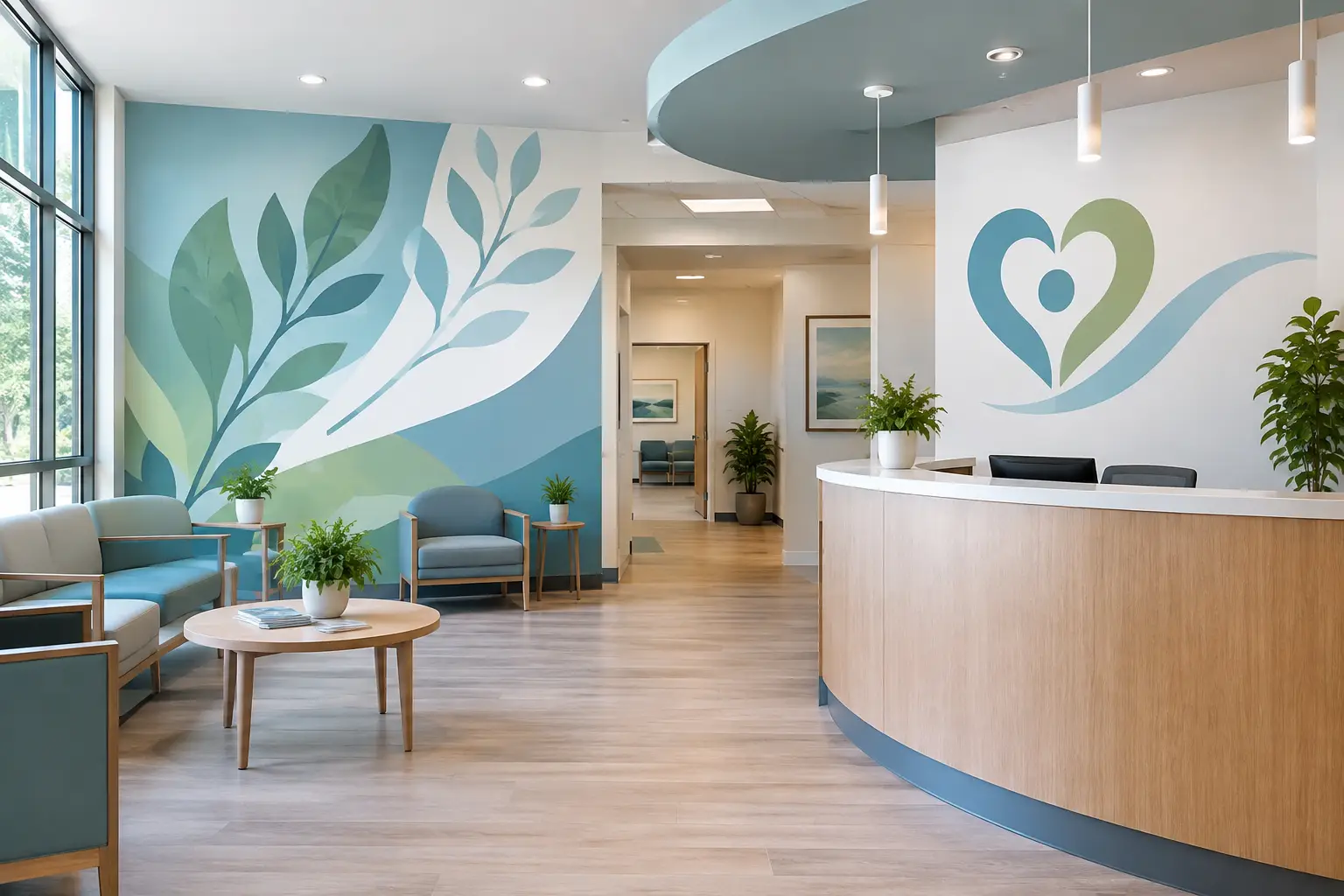
A patient can form an impression of a medical office before anyone at the front desk says hello. The entrance, waiting room, hallway, and exam room all communicate something. That is how wall graphics improve patient experience: they help a space feel clear, calm, and thoughtfully prepared for the people who need care.
For healthcare administrators, office managers, and wellness providers, the goal is not to cover every empty wall. It is to use the right words, colors, and visuals in the right places so patients feel more at ease from the moment they arrive. A thoughtful wall graphic can offer reassurance while also helping people find their way, understand what to expect, and feel that they matter.
How Wall Graphics Improve Patient Experience From the Start
Many patients arrive carrying more than a purse or clipboard. They may be worried about a diagnosis, managing pain, bringing in a child, or simply trying to make it to an appointment on time. A bare, confusing, or impersonal space can add to that tension. A welcoming visual message gives the room a warmer first impression.
This may be as simple as a reception wall with the practice name and a kind welcome message. It might include a nature-inspired printed mural in a wellness office or a few carefully chosen words that reflect the practice's commitment to compassionate care. The message does not need to be lengthy to be meaningful. Often, a clear statement such as “We’re glad you’re here” or “Your health matters to us” says enough.
The best approach depends on your patients and the kind of care you provide. A pediatric office may use playful colors and friendly illustrations, while a physical therapy clinic may choose energizing imagery and messages of progress. A dental office may lean toward quiet, calming visuals. The purpose is the same: help patients feel they have entered a place where people have considered their comfort.
Clear Wayfinding Reduces Small Moments of Stress
Finding the restroom, checking in, locating the lab, or knowing where to wait should not feel like a puzzle. When patients are already nervous or in a hurry, unclear directions can make a visit feel harder than it needs to be.
Vinyl lettering and directional wall decals can bring clarity to reception areas, hallways, doors, and waiting spaces without making the office feel overly clinical. Consistent fonts, colors, and simple language help patients know where to go next. For larger facilities, color-coded zones or visual markers can be especially helpful for visitors navigating multiple departments.
Wayfinding works best when it is planned from the patient’s point of view. Walk through the space as if you are visiting for the first time. Where do you pause? Which doors look alike? What information do you need before someone has a chance to help? Those moments reveal where a wall graphic can make a real difference.
Waiting Rooms Can Feel More Personal
No wall graphic can erase a long wait or replace thoughtful, attentive care. But it can make the time feel less cold and less uncertain. A waiting room should remind patients that they are in a place designed for people, not just appointments.
Printed wall graphics can add visual interest without requiring more furniture or clutter. A peaceful landscape, botanical design, local scene, or custom illustration can create a gentler focal point than a blank wall. For practices with a strong story or community connection, a graphic can also share that story in a way that feels welcoming rather than promotional.
Words have a place here, too. A brief message about the care team’s values can reassure patients that respect, listening, and dignity are part of the experience. In a family practice, a message about caring for every generation may feel right. In a counseling or wellness setting, a quiet reminder to take one step at a time can offer encouragement without asking too much of someone in a vulnerable moment.
The trade-off is balance. Too many messages, colors, or competing designs can make a waiting room feel busy. Choose one central visual direction, then let the rest of the space support it.
Exam Rooms Offer a Chance for Reassurance
Exam rooms are where patients may receive difficult news, ask personal questions, or wait alone. The environment should support the care conversation, not distract from it.
A small wall decal, a calming printed graphic, or a warm message can soften an otherwise functional room. Nature scenes are often a good fit because they give patients something restful to look at without demanding attention. In pediatric rooms, age-appropriate characters, animals, or simple interactive visuals can make a child’s experience feel friendlier.
For adult patients, the best graphics tend to feel grounded and respectful. Avoid messages that sound overly cheerful when a patient may be facing a serious concern. Thoughtful phrases about hope, strength, or being cared for can be meaningful, but they should fit the practice and the people it serves.
Your Values Become Visible
Patients notice when a healthcare space feels consistent. If your team says it values compassion, education, dignity, or whole-person care, your walls can help reflect those commitments in a visible, everyday way.
A mission statement in a staff area can remind employees why their work matters during a demanding day. A simpler patient-facing version in the lobby can show visitors what they can expect from the practice. These are not just decorative words. When they are authentic and placed with care, they give language to the kind of experience your team is working to create.
This is especially helpful for independent practices and community health organizations with a meaningful story to share. A wall can recognize the people who make care possible, celebrate years of service, or honor a commitment to the community. It gives patients a fuller sense of who is caring for them.
Design Details Matter in Healthcare Settings
Beautiful graphics need to work for the space, too. Before choosing a design, consider the wall surface, lighting, viewing distance, and cleaning needs. High-traffic areas may call for durable printed graphics, while a smooth interior wall may be a good fit for custom vinyl lettering or decals.
Readability should come before decoration. Use enough contrast between lettering and the wall color, keep directional messages easy to scan, and avoid placing critical information where people may block it while standing in line. If your office serves older adults or patients with visual impairments, larger lettering and straightforward wording are especially important.
It is also wise to coordinate with your facilities or infection-control team about approved materials and cleaning practices. The right choice depends on your environment and the specific product being installed. A design partner who asks about these details can help you make choices that look good and make practical sense.
Start With What Patients Need to Feel
You do not need to redesign an entire office at once. Begin with the area that has the greatest opportunity to help patients: perhaps the lobby wall patients see first, an unclear hallway, or an exam room that feels especially plain.
Then ask a few simple questions. What do we want people to feel when they enter? What do they need to know? What do we want them to remember after they leave? The answers can guide everything from color choices to the exact words on the wall.
At Wall Words, we believe the most meaningful healthcare graphics begin with listening. Your wall, your design, and your patients’ experience all deserve care. When a space reflects the heart behind your practice, patients can feel that care before the appointment even begins.
A well-chosen message or image will not replace a warm welcome from your team. It can help make that welcome visible, giving every person who walks through your door one more reason to feel seen, supported, and at ease.