
Improving Visitor Wayfinding With Meaningful Walls
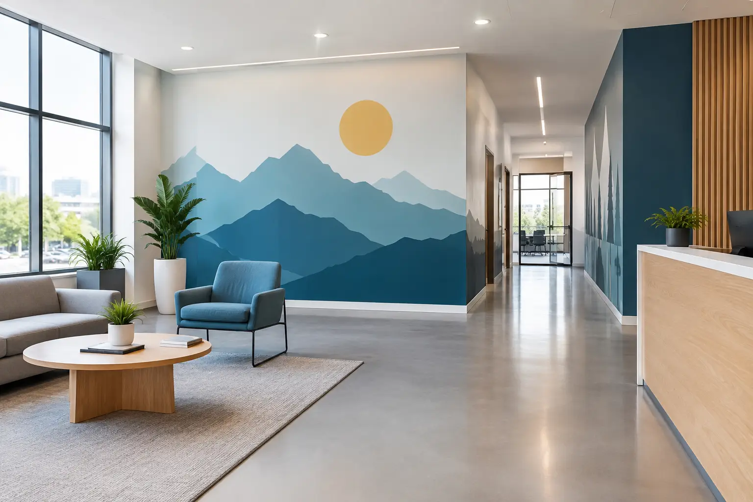
A visitor should not have to stop in the lobby and wonder where to go next. Improving visitor wayfinding begins with that small but meaningful moment: helping someone feel oriented, expected, and welcome before they ever ask for directions.
For a school family arriving for a conference, a patient checking in for an appointment, or a first-time church guest looking for the nursery, clear surroundings can ease uncertainty. Thoughtful wall graphics, window decals, and vinyl lettering do more than point people down a hall. They show that your organization has considered the experience of every person who walks through the door.
Why Wayfinding Is About More Than Direction
Wayfinding is the system that helps people understand where they are, where they need to go, and how to get there. Some of it is practical: room names, arrows, check-in instructions, and restroom signs. But the best wayfinding also carries a feeling. It says, “You are in the right place. We are glad you are here.”
That feeling matters most in places where people may already be carrying questions or stress. A medical office can use calm, easy-to-read signs to make a visit feel less overwhelming. A nonprofit can guide a new client to the right service while sharing a message of dignity and hope. A business can welcome candidates, clients, and new employees with graphics that clearly reflect its culture.
Good wayfinding does not need to be loud or overly complicated. In fact, too many signs, mixed messages, or hard-to-read labels can create more confusion. The goal is clarity with heart: give people the information they need at the moment they need it, in a style that feels true to your space.
Start With the Visitor’s Actual Journey
Before choosing fonts, colors, or materials, take a walk through your building as if you have never been there before. Begin in the parking area or at the main entrance. Where do visitors hesitate? What questions would they have before reaching the front desk? Which doors, hallways, or elevators could send them in the wrong direction?
This simple walkthrough often reveals more than a floor plan can. You may notice that the reception desk is not visible from the entrance, that two hallways look nearly identical, or that a sign is hidden behind an open door. Ask someone unfamiliar with the space to take the same walk if you can. Their fresh perspective can show you what your regular team no longer notices.
Think about the journey in small decisions. Visitors may need to find parking, an entrance, check-in, restrooms, offices, classrooms, meeting rooms, or an exit. They may also need to understand what happens next: “Check in here,” “Please have a seat,” or “Children’s check-in is upstairs.” A well-placed message can answer a question before it becomes a source of frustration.
Give Each Location One Clear Job
A lobby sign may welcome people and direct them to check-in. A hallway graphic may name the destination ahead. A door decal may confirm that they have arrived. When one sign tries to do all three jobs at once, people can miss the detail that matters most.
For example, a school entrance could use a warm welcome message near the door, a large office arrow at the first decision point, and simple vinyl lettering on the office door. Each piece works together without asking visitors to read a wall of information.
Use Visual Cues People Can Understand Quickly
People rarely stand still and study a sign for long. They are walking, carrying bags, helping children, checking a phone, or arriving a few minutes late. Your wayfinding should be easy to notice and understand at a glance.
Start with contrast. Light lettering on a light wall may look subtle and beautiful up close, but it can disappear from several feet away. Darker lettering, a colored graphic panel, or a carefully chosen accent color can make key instructions easier to see. The right choice depends on your existing décor, available light, and the distance from which people need to read the sign.
Size matters, too. A room label can be modest because visitors will see it up close. Directional lettering at the end of a hall needs to be larger. If someone needs to find a destination from across a lobby, use a scale that supports that real-life viewing distance rather than what looks balanced in a design mockup.
Keep language plain. “Reception,” “Restrooms,” “Counseling,” “Student Services,” and “Children’s Ministry” are more helpful than clever names that only insiders understand. If your organization uses a special name for a department or program, pair it with a clearer description when needed.
Arrows can be especially helpful, but they need to point in the exact direction a visitor should travel. This sounds obvious, yet signage can become confusing when an arrow is placed before a turn, after a turn, or beside several possible paths. Stand where the visitor will stand and test it.
Make Your Signs Feel Like They Belong to Your Story
Functional does not have to mean generic. Your signage can be clear while still reflecting the values, warmth, and personality of your organization.
A wellness office might use soft colors, calm wording, and simple botanical details around a check-in message. A church may pair a welcome direction with an encouraging phrase that helps first-time guests feel at ease. A nonprofit can include mission-centered wall graphics in the lobby while keeping service directions direct and easy to follow. A small business may use its brand colors and a confident, friendly voice throughout the space.
The key is hierarchy. Your mission, welcome message, or visual style should support directions, not compete with them. A beautiful statement wall may be the heart of a lobby, while clear vinyl lettering nearby answers where visitors should check in. Both have a purpose, and neither needs to overpower the other.
Consistency helps people trust what they are seeing. Use related fonts, colors, and shapes across room labels, directional decals, lobby graphics, and window lettering. This does not mean every sign must look identical. It means each piece should feel like it came from the same caring organization.
Plan for Different Visitors and Changing Needs
The people who know your building best are often the least likely to need signs. Plan instead for first-time guests, older adults, parents with children, people who speak different first languages, and anyone visiting during a busy or emotional moment.
You may need more visual direction in one area than another. A large campus with multiple programs may benefit from color-coded zones or distinctive icons. A smaller office may only need a clear entrance decal, a reception message, and room labels. More signage is not always better. It depends on the number of decisions a visitor has to make and how much context the space already provides.
Also consider what changes throughout the year. Schools host events. Churches welcome guests for special gatherings. Nonprofits may offer seasonal services. Businesses rearrange departments or meeting rooms. Vinyl decals and printed wall graphics can give you flexibility when a space needs an update without requiring a full renovation.
Do Not Forget the Details at Eye Level
The most useful sign is often the one that confirms a visitor has arrived: a name on an office door, a label beside a check-in window, or a decal on a glass entry. These details prevent people from opening the wrong door or returning to the front desk for reassurance.
They also create a more cared-for experience. When room names, instructions, and welcoming messages are finished thoughtfully, visitors sense that the same attention may carry into the service they receive.
Bring the Plan to Life Without Guesswork
A wayfinding project can feel like a lot to manage when you are already leading a team, serving clients, or preparing for a new school year. Start with a simple list of locations, messages, and goals. Photos of each wall, door, or window are helpful, along with approximate measurements and notes about how people move through the building.
From there, the design should account for viewing distance, wall color, existing décor, installation surface, and the tone you want visitors to feel. Custom vinyl lettering works beautifully for room names, directional messages, and mission statements. Printed wall graphics can add color, maps, icons, or more detailed visual elements where they will help people orient themselves.
Wall Words approaches this process with the same care you bring to your visitors. Our team listens to what your space needs, helps shape the details, and creates custom graphics designed to be clear, meaningful, and easy to install. Your wall, your message, and a plan that helps people feel confident from the moment they arrive.
A few well-chosen words in the right places can turn a confusing hallway into a clear path forward. More importantly, they can remind every visitor that someone planned for them to be there.