
Interior Wall Graphics Trends That Matter
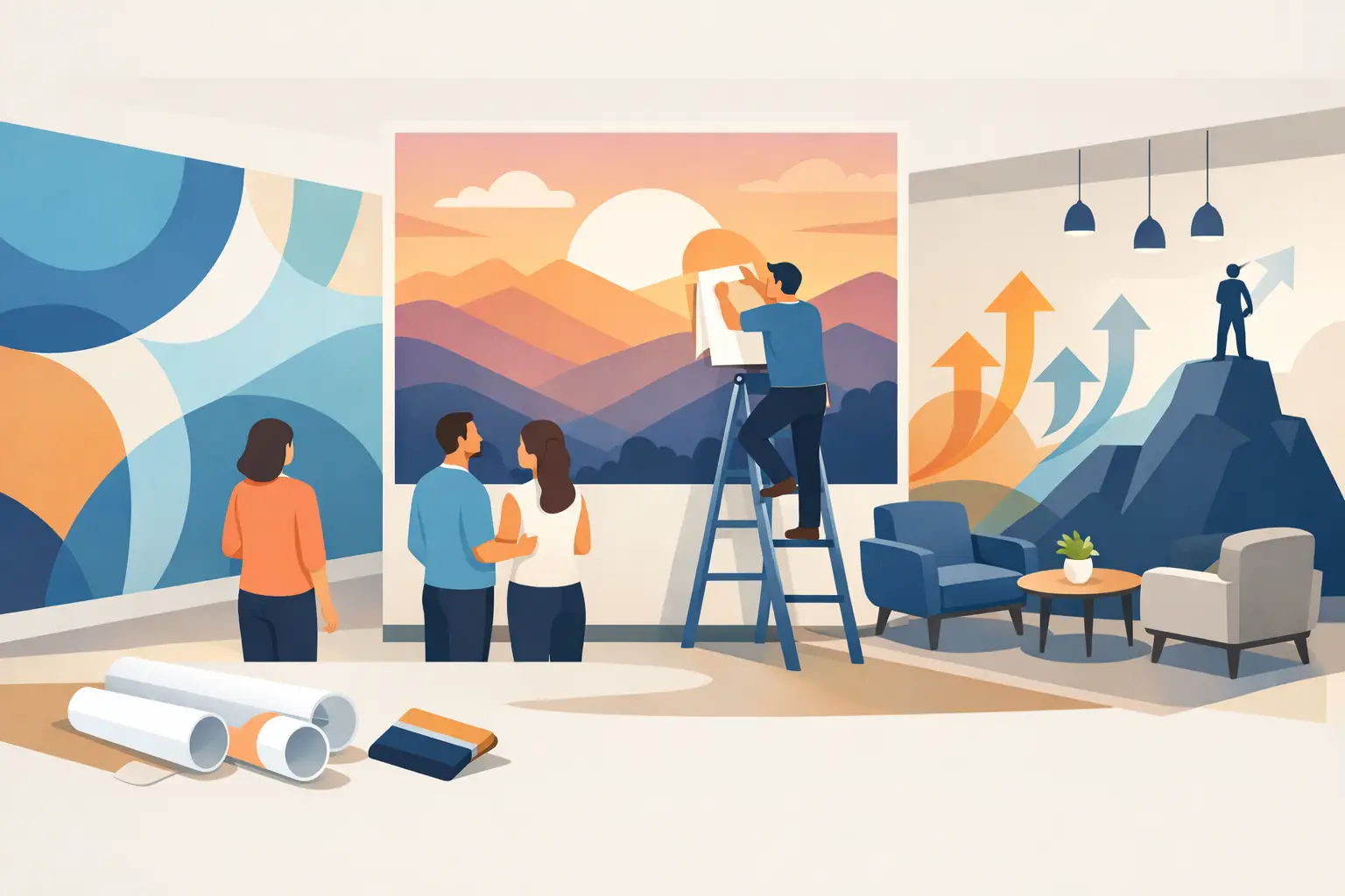
A blank wall says more than most people realize. In a church lobby, it can feel unfinished. In a school hallway, it can miss an opportunity to reinforce identity. In an office or wellness space, it can leave people wondering what your organization stands for. That is why interior wall graphics trends are moving in a clear direction: away from decoration for decoration’s sake and toward visual messaging that helps people feel oriented, welcomed, and connected.
For organizations that serve others, this shift matters. The best graphics are not just attractive. They help visitors understand your mission, remind staff why their work matters, and turn everyday spaces into places with clarity and purpose.
The biggest shift in interior wall graphics trends
The strongest trend right now is intentionality. A few years ago, many interiors leaned heavily on generic accent walls, trendy patterns, or large graphics that looked good in photos but did not say much. Today, organizations are asking more from their walls.
They want graphics that do a job. That could mean a mission statement in a nonprofit entryway, core values in a staff workspace, scripture in a ministry setting, donor recognition in a development office, or branded messaging in a small business lobby. The wall is no longer just part of the background. It has become part of how an organization communicates every day.
This does not mean every wall should be covered. In fact, one of the clearest signs of thoughtful design is restraint. A single well-placed statement can carry more weight than an entire room filled with visual noise.
Branded environments are replacing generic decor
One of the most practical interior wall graphics trends is the move toward branded interiors that feel specific to the organization. Instead of choosing art because it fills space, leaders are choosing custom graphics that reflect who they are.
For a school, that might look like mascot graphics, school values, and hallway messaging that builds pride. For a medical or wellness office, it may be calm, clean typography paired with soft visual elements that support trust and comfort. For a small business, it could be a logo wall, team values, and customer-facing brand language that makes the space feel polished and consistent.
This trend works because people notice alignment. When your website, printed materials, and physical space all feel connected, your organization comes across as more established and more thoughtful. That matters whether you are welcoming a first-time visitor, a donor, a patient, or a new employee.
Typography is getting bolder, but also more meaningful
Large-scale lettering remains popular, but the trend has matured. It is not just about putting big words on a wall. It is about choosing the right words, setting them in the right style, and placing them where they will have daily impact.
Clean, readable fonts are leading the way, especially in professional spaces. Script fonts still have their place, particularly when the goal is warmth or inspiration, but many organizations are leaning toward typography that feels timeless and clear rather than overly decorative.
The message itself matters just as much as the style. Shorter statements often work better than long blocks of text. A mission line, a set of values, or a simple phrase with emotional weight is easier to absorb at a glance. If a wall requires someone to stop and read for several minutes, it may be better suited for a display area than a main corridor.
Tone-on-tone and neutral palettes are growing
Color is still important, but many current spaces are moving away from overly loud combinations. One of the more refined interior wall graphics trends is the use of tone-on-tone design, soft neutrals, and controlled contrast.
This approach works especially well in healthcare, counseling, education, and office settings where the environment should feel calm and professional. Matte finishes, warm whites, sand tones, muted blues, charcoal, and natural greens can create visual interest without overwhelming the room.
That said, this is not a rule for every space. Some brands need high energy. A youth area, creative office, children’s wing, or community center may benefit from stronger color and more movement. The real trend is not minimal color. It is using color with purpose.
Privacy and glass graphics are becoming part of the design story
Interior wall graphics are no longer limited to drywall. More organizations are using glass doors, conference rooms, office fronts, and interior windows as part of a larger visual system.
This is partly aesthetic, but it is also functional. Frosted or printed glass graphics can add privacy without making a space feel closed off. They can carry logo elements, mission phrases, directional information, or subtle branding that helps tie the whole environment together.
For offices and clinics, this trend solves two problems at once. It makes the space feel more finished while also improving comfort and usability. For churches, schools, and nonprofits, glass can become a welcoming place to reinforce identity without adding clutter.
Wayfinding is becoming more human
People do not always talk about wayfinding as a design trend, but they should. One of the smartest shifts happening right now is the use of wall graphics to make spaces easier to understand.
This can be as simple as clear room names, directional phrases, or department labels designed to match the rest of the environment. In larger buildings, it may include color-coded zones, floor identifiers, or hallway messaging that helps visitors know where they are and where to go next.
When wayfinding is handled well, people feel cared for. They are less likely to feel lost, confused, or hesitant. That is especially valuable in schools, churches, medical offices, and nonprofit facilities where visitors may already be arriving with questions or stress.
Mission-driven messaging is standing out more than ever
This trend is especially important for organizations with a strong sense of purpose. More leaders are realizing that the walls inside their building can reinforce culture every single day.
A mission statement in the lobby is not just for visitors. It is for the team that walks past it every morning. Core values in a staff area are not just visual fillers. They are reminders of how people want to work together. Donor walls are not just recognition pieces. They tell a story of impact and gratitude.
This is where custom design matters. Purpose-driven messaging should not feel copied from another space. The best results come from tailoring the scale, wording, materials, and placement to the people who will experience it.
What is fading out
Some trends are losing momentum, and that is worth noting if you are planning a project. Overly busy collage walls, generic stock phrases, and designs that chase social media style over substance are becoming less appealing. They can date a space quickly and often do not reflect the organization in any meaningful way.
Another fading habit is treating wall graphics as an afterthought. When graphics are chosen at the very end with no larger plan, they tend to feel disconnected. A better approach is to think about the full experience from the start. What should people feel when they enter? What should they understand right away? What message should stay with them after they leave?
How to choose a trend that will last
Not every trend deserves a place in your space. The strongest choices usually come from asking a few practical questions.
First, who uses this space every day? Staff, volunteers, students, patients, donors, and visitors may all need something different. Second, what should the environment communicate without anyone having to explain it? Third, how long do you want the design to feel relevant?
Timeless does not have to mean plain. It simply means building around your mission rather than around what feels fashionable for a season. That is often why custom vinyl lettering, decals, and printed graphics continue to work so well. They can be highly personalized, visually strong, and easier to update than full renovation work.
It also helps to think in zones instead of trying to solve the whole building at once. A lobby may need branding and welcome messaging. A hallway may need directional support and values. A meeting room may need privacy graphics or a statement wall. Breaking the project into parts usually leads to better decisions and a more cohesive result.
At Wall Words, we see the best outcomes when customers start with purpose first and style second. The finished graphics still look beautiful, but they also do something meaningful for the people in the space.
Interior wall graphics trends will keep evolving, but the most effective spaces tend to share the same foundation: clear messaging, thoughtful design, and a real understanding of the people walking through the room. If your walls can help someone feel more welcome, more confident, or more connected to your mission, that is a trend worth following.