
Medical Office Atmosphere Guide for Calm Care
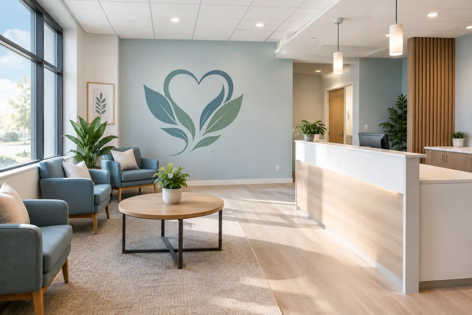
A patient may spend only a few minutes with a provider, but the experience begins much earlier - at the front door, the check-in desk, and the first seat in the waiting room. This medical office atmosphere guide is for the leaders and teams who want those first moments to say, “You are welcome here. We are ready for you.”
A caring atmosphere does not require a complete renovation or a picture-perfect lobby. It comes from thoughtful choices that reduce uncertainty, make information easier to find, and reflect the people behind the practice. A calm, professional space can support patients who are nervous, uncomfortable, short on time, or bringing a loved one for care.
Start With the Feeling You Want Patients to Have
Before choosing colors, signs, or wall graphics, pause at the door and consider the patient experience. What should someone feel as they enter? Reassured? Respected? Hopeful? Clear about where to go next? The answer gives every design choice a purpose.
A pediatric office may lean into warmth, encouragement, and friendly visual cues. A dental office may want a polished, peaceful environment that helps ease anxiety. A physical therapy or wellness practice may focus on forward movement, strength, and possibility. There is no single right look for every medical office. What matters is that the space feels consistent with the care your team provides.
That consistency is often felt in small details. A welcome message at the entrance, an easy-to-read check-in sign, and a thoughtfully displayed practice value can work together to make the office feel intentional rather than impersonal.
Make Arrival Simple, Not Stressful
Patients should not have to guess where to enter, check in, sit, or find a restroom. When people are unsure what to do, even a beautiful office can feel less welcoming. Clear visual communication is one of the kindest things a practice can offer.
Use window lettering or door decals to identify entrances and hours. At the reception area, simple wall or counter messaging can direct patients to check in, complete forms, or let the team know they have arrived. In larger suites, hallway decals and room labels can help patients move through the office without repeatedly asking for directions.
Keep the wording brief and friendly. “Please check in here,” “We’re glad you’re here,” and “Restrooms this way” are often more helpful than lengthy instructions. Choose a font size and color contrast that patients can read from a natural distance. If your patient population includes older adults or people with vision challenges, clarity should guide every choice.
Create a Waiting Room That Feels Considered
Waiting is rarely anyone’s favorite part of an appointment. Still, a waiting area can communicate patience and care when it feels clean, organized, and human. Begin by looking at the room through a visitor’s eyes. Is there a natural place to sit? Is the wall behind the seating blank in a way that feels cold, or crowded in a way that feels overwhelming?
A large wall graphic can bring warmth to an open waiting-room wall without taking up floor space. For some practices, that might be a soft botanical design, a calming landscape-inspired image, or a subtle pattern in colors already used throughout the office. For others, it may be a short message that reflects the practice’s approach to care.
The best message is usually not the longest one. A few well-chosen words can carry more comfort than an entire paragraph. Consider language that is gentle and true to your team, such as “Care begins with listening,” “Here for your health,” or “You matter to us.” Avoid promises that sound too broad or clinical. A wall message should feel like a genuine extension of your staff, not a marketing line.
Comfort also comes from visual breathing room. If you display awards, brochures, notices, children’s materials, and health information in the same area, choose one wall or zone for each purpose. Patients can absorb useful information more easily when every surface is not competing for attention.
Use Your Walls to Tell Patients What You Value
Medical offices are often built around deeply held values: compassion, respect, teamwork, education, dignity, and service. Yet many patients never see those values stated clearly. A mission statement or a few core values can give the office a sense of heart, especially when they are displayed where patients and team members will actually notice them.
A reception wall may be the right place for a brief statement about how your practice cares for people. A staff hallway or break room can hold words that encourage the people doing demanding work each day. Exam-room graphics can also be meaningful, but they should be used with restraint. Patients need an environment that feels calm and uncluttered, not a room full of messages competing for their attention.
Custom vinyl lettering works especially well for values, welcoming phrases, and directional messages because it can be sized and colored for the exact wall. Printed wall graphics can be a better fit when the design includes logos, images, color blends, or detailed artwork. The choice depends on your space, your message, and how much visual presence you want the finished piece to have.
Choose Colors and Graphics With Care
Color can influence whether a room feels energetic, calm, modern, or warm. In healthcare settings, softer neutrals, natural greens, gentle blues, and muted earth tones are common choices because they tend to feel restful. But a medical office does not need to look identical to every other office. Your brand colors can still belong in the space when they are used thoughtfully.
A bright brand color may work beautifully as an accent in a logo decal, room label, or small reception-wall detail. Using that same color across an entire room may feel too intense for a space designed for rest. It depends on the shade, the amount of natural light, the type of care you provide, and the people you serve.
When selecting wall lettering or graphics, ask for color samples if you are unsure how a shade will read against your existing paint. Lighting changes color more than many people expect. A tone that feels soft in a sample image may look much cooler or brighter under office lighting.
Keep Practical Needs at the Center
A welcoming medical office still has to work hard every day. Materials should be chosen with cleaning routines, wall texture, traffic levels, and placement in mind. Before installing any wall decal or graphic, confirm that it suits your wall surface and your office’s cleaning practices. Your facilities team or cleaning partner may have helpful input about areas that receive frequent wiping or contact.
Placement matters, too. Put important directions where patients naturally pause or make decisions: near entrances, elevator exits, check-in areas, and hallway turns. Keep graphics away from places where furniture, open doors, or equipment will block them. In exam rooms, consider what a patient sees from the chair or table, not only what looks good from the doorway.
For busy office managers, the process can feel like one more project on a long list. It helps to begin with a simple plan: identify the patient journey, choose the walls that need the most attention, and prioritize the messages that will make the biggest difference. You do not have to transform every room at once.
Bring Your Team Into the Process
Your staff sees the office through patients’ eyes every day. They know which questions come up at check-in, where visitors get lost, and which areas feel forgotten. Invite a few team members to walk through the space with you and share what they notice.
Their input can lead to practical improvements, such as clearer suite numbers, a friendlier check-in message, or a staff-room wall that recognizes the care they bring to difficult days. It can also help you avoid creating graphics that look good on paper but do not solve a real need in the office.
When you are ready to create custom lettering or wall graphics, bring your ideas, photos, measurements, and any existing logo files together. A thoughtful design partner can help you sort through font choices, color options, sizing, and installation details so the final piece feels at home in your space. At Wall Words, that kind of guidance starts by listening to what you want patients and staff to feel.
Your office does more than provide appointments and answers. It gives people a place to arrive with questions, concerns, and hope. Let each wall help them feel that they have come somewhere prepared to care.