
Mission Driven Office Design That Feels Like You
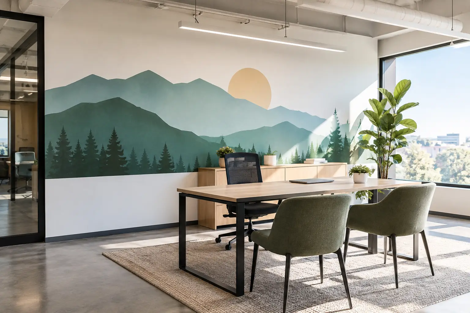
A blank lobby wall can say more than you mean it to. So can a crowded break room, a confusing hallway, or a reception desk with no sign of the people and purpose behind the work. Mission driven office design gives those spaces a voice, helping employees, visitors, patients, clients, and volunteers understand what matters the moment they arrive.
This is not about covering every wall with quotes. It is about choosing meaningful words, images, and details that make people feel welcomed, informed, and connected. When your space reflects your mission with care, it becomes part of how you serve people.
What Mission Driven Office Design Really Means
Mission driven office design begins with a simple question: What do we want people to feel and understand here?
For a nonprofit, that may mean helping a first-time visitor see the real impact of the organization before a meeting even begins. For a medical or wellness office, it may mean creating a calm environment that helps patients feel cared for. A school may want students to see reminders of belonging, character, and possibility. A small business might want its team to be surrounded by the values that shape how they work together.
The mission should not live only in an employee handbook or on a page few people read. It can become part of the everyday experience of being in your space. Thoughtful vinyl lettering, printed wall graphics, window decals, and donor recognition displays can make the heart of your organization visible.
The best designs do more than decorate. They answer unspoken questions: Who are you? Who do you serve? What do you believe? Why does this work matter?
Start With the People Who Walk Through Your Door
Before choosing colors, fonts, or a wall, consider the people using the space. Their experience should guide the design.
A front lobby has a different job than a staff hallway. In the lobby, a welcome message, mission statement, logo, or visual story can orient guests right away. In a staff area, core values or a meaningful phrase can encourage the people carrying out the mission every day. A conference room may be the right place for a story of growth, a timeline, or a display that helps partners understand your work.
It also helps to think about what visitors may be feeling when they arrive. A family entering a counseling office may be nervous. A new church guest may wonder where to go. A donor visiting a nonprofit may want to see how their generosity makes a difference. A clear, warm message can help people feel more at ease.
That does not mean every wall needs to be emotional or expressive. Some spaces need practical communication first. Directional window decals, room labels, check-in instructions, and wayfinding graphics can be just as mission-centered when they make someone’s visit simpler and more welcoming.
Let Each Space Have One Clear Purpose
Trying to say everything at once is one of the easiest ways to dilute a meaningful message. A long mission statement may belong in a gathering space where people can pause and read it. A busy hallway may need a shorter phrase or a few values that can be understood at a glance.
Give each wall a role. It might welcome, guide, encourage, honor, teach, or tell a story. When the role is clear, the design decisions become easier.
Bring Your Mission Into the Everyday Details
Purpose is often communicated through the small moments people experience again and again. That is where office wall graphics can make a lasting difference.
A receptionist who sits beneath a message about compassion is reminded that their role matters. A student passing a hallway display about kindness sees that value reinforced outside the classroom. A team member walking into a meeting sees a phrase that brings the conversation back to the organization’s purpose.
There are many ways to use words and graphics with intention:
- A mission statement or shortened mission phrase in a lobby or reception area
- Core values displayed where employees gather, collaborate, or take breaks
- Donor walls that recognize generosity with warmth and gratitude
- Scripture, encouragement, or ministry messages in church and community spaces
- Branded logos, colors, and taglines that make a small business feel established and personal
- Window decals and directional lettering that make it easier for visitors to find their way
The right choice depends on the space and the audience. A pediatric office may use gentle colors and simple, friendly language. A professional service firm may prefer a more refined layout with clean lettering and fewer visual elements. Both can feel true to their mission when the message fits the people they serve.
Choose Words People Can Feel
Some organizations choose language because it sounds impressive. The words that stay with people are usually simpler and more honest.
Start with phrases your team already says. Perhaps you often tell families, “You belong here.” Maybe your staff returns to a value like “Serve with compassion” or “Learn with courage.” These are not marketing lines created for a wall. They are expressions of the culture you want people to experience.
If your mission statement is longer, pull out the strongest part rather than forcing every word into a display. You can pair a concise phrase with a smaller version of the full statement nearby. This keeps the design readable while still honoring the complete message.
Consider the distance from which people will see it, too. Large lettering works beautifully for a statement across a lobby wall. Smaller text can support a display, but it should not carry the whole message in a high-traffic area. Good design helps people absorb the words naturally instead of working to read them.
Use Color and Typography With Care
Color and font choices should support the feeling of the message, not compete with it. A peaceful healthcare setting may benefit from softer tones and open, easy-to-read type. A school spirit wall may call for brighter color and more energy. A donor recognition display often feels most timeless with a clean layout that leaves room for every name to be seen and appreciated.
Your existing brand colors are a helpful starting point, but they do not have to control every surface. A single accent color, neutral vinyl lettering, or a frosted window decal may suit the space better. Samples can be especially helpful when lighting, wall texture, and surrounding finishes affect how a color appears.
Typography matters for the same reason. Script fonts can feel personal and warm, but they may be difficult to read from a distance. Bold, simple fonts are often a better choice for directional signs and core values. Mixing too many fonts can make a wall feel busy, so keep the visual language focused.
Plan for Real Walls, Not Just a Mockup
A design can look wonderful on a screen and still need adjustment for the actual room. Measure the wall carefully, including furniture, outlets, doors, trim, light switches, and anything that may interrupt the layout. Take photos from the angle visitors will see first.
Wall condition matters, too. Smooth, clean, painted surfaces are generally the easiest for vinyl lettering and decals. Textured walls, fresh paint, and unusual finishes may require a different approach or additional planning. Printed wall graphics can be a beautiful option for larger visual storytelling, while individual vinyl letters may be ideal for a crisp mission statement or logo.
Installation should feel manageable, not like another stressful project on a busy leader’s list. Clear placement guidance, careful production, and a design sized for the real space all help. For more detailed projects, it is worth asking questions early about surface type, installation needs, and how the design will arrive.
At Wall Words, the process starts by listening to what you want people to feel in the space. From there, custom lettering and graphics can be shaped around your message, your walls, and the details that matter to you.
Make Room for Your Story to Grow
Not every mission-centered space needs to be finished all at once. A phased approach can work well for organizations with several rooms, changing programs, or a developing vision. Start with the entry area or the place where people gather most often. Then build outward as your budget and needs allow.
It is also wise to leave room for change. Staff values may stay constant for years, while program information, donor names, seasonal messages, or service details may need updates. Permanent-looking design does not have to mean inflexible design. Thoughtful planning can help you create a space that feels rooted while still serving the future.
Your office does not need to be large, newly renovated, or perfectly styled to communicate purpose. One well-placed message can change how a room feels. Begin with the words that are already true about your organization, then give them a place where people can see, remember, and carry them with them.