
Mission Wall Graphics vs Signage
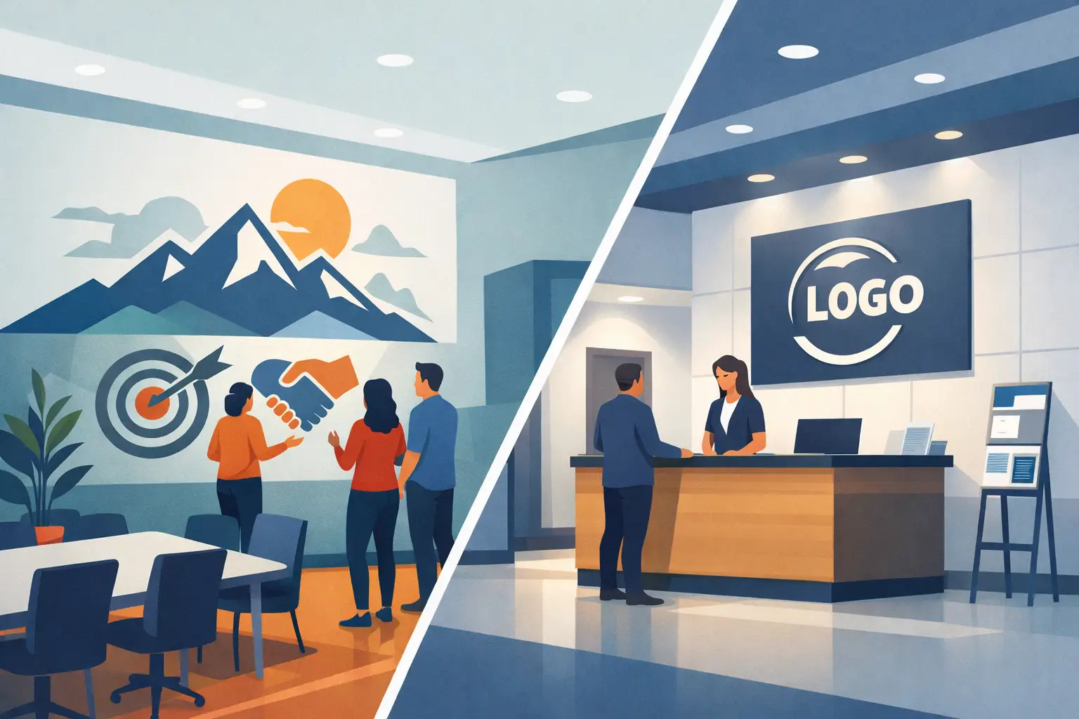
A lobby sign can tell people where they are. A mission wall can tell them why it matters.
That difference sits at the heart of mission wall graphics vs signage. If you are designing a church entry, nonprofit office, school hallway, wellness clinic, or small business interior, the choice is not simply about what looks better on the wall. It is about what your space needs to communicate the moment someone walks in.
In many cases, both have a place. But they do different jobs, create different emotional effects, and fit different budgets, surfaces, and long-term goals. When you understand those differences, it becomes much easier to choose the right solution for your space.
Mission wall graphics vs signage: what is the real difference?
Traditional signage is usually direct and functional. It identifies a room, displays a logo, points visitors in the right direction, or shares essential information. Think reception signs, directional signs, room IDs, and branded plaques. Signage is often built to be read quickly and understood immediately.
Mission wall graphics serve a broader role. They turn blank walls, glass, and interior surfaces into part of your message. Instead of only identifying a place, they help define the culture inside it. A mission statement in vinyl lettering, a donor recognition wall, a set of core values in a conference room, or a calming quote in a wellness office all fall into this category.
So when people compare mission wall graphics vs signage, the better question is this: do you need to label the environment, or shape the experience of it?
That is where the decision usually begins.
When signage is the better fit
If your priority is clarity, navigation, or quick brand recognition, signage often makes the most sense. A front desk logo sign creates a polished first impression. Wayfinding signs help visitors move through a campus or office with less confusion. Room signs and compliance-related signs handle practical needs that wall graphics are not meant to replace.
This is especially true in larger buildings or high-traffic environments. Schools, medical offices, churches, and nonprofit facilities often need people to find the right room without hesitation. In those settings, signage does important work because it removes friction.
Signage can also feel more dimensional and permanent, depending on the material. Acrylic, metal, PVC, or layered signs can give a reception area a structured, finished look. If your goal is a formal branded focal point behind a desk or in an entry, signage may deliver the exact visual weight you want.
Still, signage usually communicates in shorter bursts. It tells people where to go or what they are looking at. It does not always tell the deeper story.
When mission wall graphics make a bigger impact
Mission wall graphics are often the stronger choice when your environment needs to inspire, reinforce values, or create emotional connection. They are especially effective in spaces where culture matters just as much as function.
A nonprofit can place its mission statement where staff, volunteers, and donors see it every day. A church can use scripture or welcome messaging to create warmth before a word is spoken. A school can display its values in a hallway where students pass between classes. A small business can turn an ordinary office wall into a daily reminder of what the team stands for.
This is where graphics do something signage often cannot. They become part of the room rather than a separate object attached to it. Because vinyl lettering and custom printed wall graphics can scale across large surfaces, they can shape the entire feeling of a space in a way that feels intentional and integrated.
That matters more than many organizations expect. People respond to the spaces around them. They notice whether a wall feels empty, generic, welcoming, or purposeful. A well-designed mission graphic can help someone understand your identity before they ever sit down for a meeting.
Mission wall graphics vs signage for budget and flexibility
Budget is one of the most common deciding factors, and this is where the answer depends on your priorities.
Signage can range widely in price based on material, size, thickness, installation method, and dimensional features. A custom lobby sign with raised letters or specialty finishes can create a beautiful result, but it is often a larger investment.
Mission wall graphics are usually a more flexible option, especially for covering larger visual areas without major construction or renovation. Vinyl lettering and printed decals can deliver a strong custom look at a more approachable price point. They also open up more design freedom with fonts, colors, layout, size, and placement.
That flexibility is helpful for organizations that want a high-impact transformation without rebuilding a space. If your budget needs to stretch across multiple rooms, wall graphics may allow you to create a more complete visual environment.
There is also the question of updates. If your mission language changes, your donor wall grows, or your branding evolves, graphics are often easier to refresh than hard-built signage. That does not make them temporary in a negative sense. It simply means they can adapt more easily as your organization grows.
The design experience is different too
One of the clearest differences in mission wall graphics vs signage is how the design process unfolds.
Signage tends to be product-first. You select dimensions, materials, finishes, mounting style, and placement. The design question is often how to make the sign look clean, readable, and consistent with your brand.
Mission wall graphics are usually message-first. The words themselves matter. The layout matters. The size, spacing, and surrounding architecture all influence whether the message feels powerful or crowded. A mission wall is not just installed. It is composed.
That is why design support matters so much. A phrase that looks fine on paper may not have enough presence on a 14-foot wall. A donor display may need room to expand. A school value statement may need to be readable from farther away than expected. Good wall graphics are not just printed accurately. They are planned thoughtfully for the real space.
For busy directors, administrators, pastors, office managers, and business owners, that guidance can make the process far easier. Instead of guessing what will work, you can build around the room, the message, and the people who will experience it every day.
Choosing between mission wall graphics vs signage by space type
The best option often becomes clearer when you think about the job of the room itself.
In reception areas, signage often works well when you need strong brand identification at a single focal point. But if that same area feels cold or unfinished, a mission statement or welcome graphic nearby can add warmth and meaning.
In hallways, break rooms, classrooms, worship spaces, counseling offices, and conference rooms, wall graphics often have the advantage because they can turn overlooked surfaces into communication tools. These are spaces where people pause, gather, reflect, or work together. That makes them ideal for values-based messaging.
In medical and wellness settings, the decision often depends on tone. Signage can keep the environment organized and professional. Wall graphics can soften it, calm it, and make it feel more human. Many offices benefit from both.
For nonprofits and churches, mission wall graphics often carry unusual value because the message is central to the work. Visitors, supporters, and team members are not just looking for directions. They are looking for connection and clarity. A visible mission can provide both.
Often, the best answer is not either-or
In real spaces, this is rarely a strict choice. The most effective interiors usually combine the strengths of both.
Signage handles identification and navigation. Mission wall graphics reinforce purpose, culture, and story. One supports function. The other supports connection. Together, they create a space that feels both clear and meaningful.
For example, a school might use signage for offices and classrooms, then use wall graphics for its vision statement and student values. A church might install a clean lobby sign at reception, then add scripture or welcome messaging in gathering spaces. A nonprofit might use directional signs for visitor flow and a mission wall to anchor donor conversations.
That layered approach tends to feel complete because it addresses both practical needs and emotional ones.
How to decide with confidence
If you are still weighing mission wall graphics vs signage, start with three simple questions. What does this space need people to know right away? What does it need them to feel? And what needs to stay flexible over time?
If the answer is mostly directional, formal, or identification-based, signage may be the better starting point. If the answer is cultural, inspirational, or story-driven, wall graphics may give you more impact. If it is both, then a combined approach is likely the strongest path.
The good news is you do not need a massive renovation to create a more purposeful environment. Sometimes the right words, placed thoughtfully, can change how a room feels and how people respond to it. That is especially true when the design is customized to your mission instead of pulled from a generic template.
At Wall Words, we see this every day. Blank walls become reminders of purpose. Entryways become warmer. Offices become more aligned. And the message people care about most becomes visible in a way that supports the work happening inside the space.
If your walls are still quiet, this may be the right time to ask more of them.