
A Nonprofit Impact Wall Example That Connects
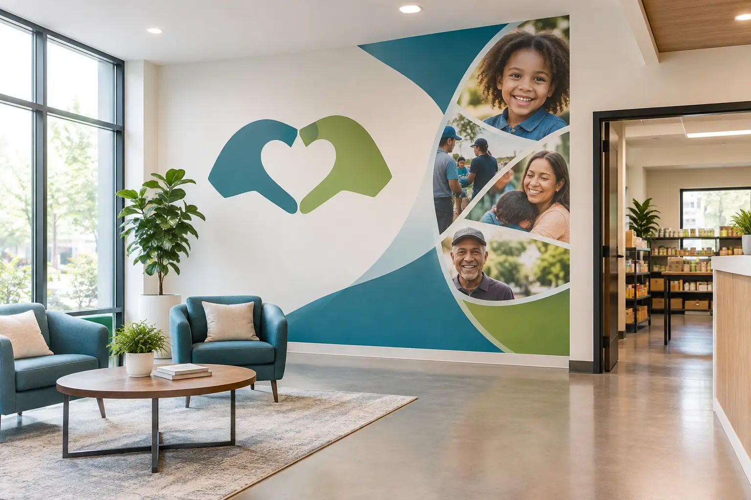
A visitor may only spend a few minutes in your lobby, hallway, or community room. In that short time, a thoughtful nonprofit impact wall example can help them understand who you serve, why your work matters, and how they can be part of the story. It turns a blank surface into a welcome, a reminder, and a visible expression of purpose.
For a busy nonprofit team, that matters. You may have powerful stories, meaningful numbers, grateful families, dedicated volunteers, and generous donors - but not much room in a brochure or time during every conversation to share it all. An impact wall gives those moments a permanent place in your space.
What Is a Nonprofit Impact Wall?
An impact wall is a custom visual display that shares the difference your organization makes. It can include a mission statement, service statistics, donor names, photos, milestone dates, short stories, values, or a simple invitation to get involved. The best version is not the one with the most information. It is the one that helps people quickly feel the heart behind your work.
Some organizations create a large lobby feature that visitors see as soon as they arrive. Others use a hallway, gathering room, volunteer area, or meeting space. A smaller wall can be just as meaningful when it is clear, well-designed, and placed where people naturally pause.
Vinyl lettering and custom wall graphics work especially well for these displays because they can be tailored to your organization’s colors, wording, logo, available wall space, and goals. They also allow the wall itself to remain part of the design rather than hiding it behind a bulky sign.
A Nonprofit Impact Wall Example for a Community Food Pantry
Imagine a community food pantry with a simple entry hall. Families come through the door for support. Volunteers arrive for a shift. Local donors occasionally stop in to drop off supplies. The organization wants every person to understand that the pantry is a place of dignity, care, and community.
At the center of the wall is its mission in large, welcoming lettering:
“Nourishing neighbors with food, hope, and respect.”
Below it, a short paragraph explains the work in plain language: “Each week, our pantry provides fresh food and household essentials to local families while connecting neighbors with resources and support.” The message is easy to read from several feet away and gives new visitors immediate context.
On one side, four large numbers show the organization’s recent impact: families served, volunteer hours given, pounds of food distributed, and community partners involved. These numbers are meaningful, but they are not left to stand alone. A brief caption adds warmth: “Every number represents a neighbor, a helping hand, and a meal shared.”
On the other side, a row of small photo panels and short first-name stories introduces the people behind the work. One may honor a longtime volunteer. Another might share a quote from a community partner. A third could thank supporters who made a new refrigeration program possible. The goal is not to tell every story. It is to offer real glimpses of the people who make the mission possible.
Near the bottom, the pantry includes a simple call to action: “Give time. Give food. Share hope.” A nearby space can hold a changeable printed notice for current needs, events, or volunteer information. The permanent wall communicates the organization’s lasting purpose, while the smaller update area keeps it useful throughout the year.
This nonprofit impact wall example works because it balances facts with feeling. It does not ask visitors to read a report on the wall. It helps them understand the mission, see evidence of care, and recognize that they have a place in the story.
Start With the Feeling You Want People to Leave With
Before choosing fonts, colors, or photos, consider the experience you want to create. A youth-serving organization may want its wall to feel energetic and hopeful. A hospice support nonprofit may need a quieter, more comforting tone. An arts program might lead with creativity and color, while a housing organization may focus on stability, belonging, and new beginnings.
A useful question is: What should someone understand or feel after standing here for thirty seconds? The answer helps determine what belongs on the wall and what can stay in an annual report, on a website, or in a handout.
For many organizations, the answer includes three things: “We are here for people,” “our work is making a difference,” and “you are welcome to help.” Those ideas can guide every design choice.
Choose One Main Message
An impact wall needs a clear anchor. Often, that is your mission statement or a shorter version of it. If your official mission is lengthy, consider whether a warm, memorable phrase can lead the display, with the full statement in smaller type beneath it.
For example, “Building brighter futures together” may be easier to take in at a glance than a full formal description. The supporting text can then explain how your organization does that work. This approach keeps the wall welcoming without losing clarity.
Use Numbers With Context
Impact statistics build trust, especially for donors, volunteers, and community partners. Still, a long string of numbers can feel distant. Choose a few measures that truly represent the work, and pair them with simple language.
Instead of only displaying “2,400,” consider “2,400 children received tutoring support this year.” Instead of “685,” try “685 nights of safe shelter provided.” The difference is small, but it brings the number back to the human reason it matters.
Be thoughtful about how often the numbers change. If your figures are updated annually, a printed panel or changeable area may make more sense than permanent lettering. If a milestone will remain meaningful for years, custom vinyl can give it a lasting home.
Make Donor Recognition Feel Personal
Donor recognition is often part of an impact wall, but it should feel connected to gratitude rather than separate from the mission. Names can be organized by giving level, alphabetically, or around a central message of thanks. The right choice depends on your organization’s culture and the commitments you have made to supporters.
A donor wall does not have to be formal to be meaningful. A children’s program might use colorful leaves, stars, or building blocks with names incorporated into the design. A conservation group might create a landscape-inspired display. A health-focused organization may choose a calm, clean layout that honors generosity without overwhelming the space.
Privacy matters, too. Confirm name spelling, preferred recognition language, and whether every donor wishes to be listed. If names will change regularly, plan for that from the beginning. Individual vinyl names can be added over time, while a printed recognition panel may be better for frequent updates.
Design for Real Walls, Not Just a Screen
A beautiful design mockup still has to work in your actual space. Measure the full wall, but also notice doors, outlets, furniture, windows, lighting, and the distance from which people will read it. A statement that looks large on a computer may feel too small across a lobby.
Color should support readability. High contrast is generally easier to read, especially in hallways with changing light. If your brand uses soft colors, consider pairing them with a deeper background color or using dark lettering for the main message. Photos and graphic elements can add personality, but they should not compete with the words people need to see first.
Leave room to breathe. A wall filled edge to edge can make visitors work too hard. Open space helps the mission stand out and gives the display a calm, intentional feel.
A Simple Planning Process for Busy Teams
You do not need to have every answer before beginning. Start by gathering your mission statement, logo, brand colors, favorite photos, current impact figures, and any donor recognition requirements. Then identify the wall you want to use and take a few clear photos of it from different angles.
From there, decide what must be permanent and what may need updating. That one choice can save time and help shape the materials you choose. It also helps to appoint one person to collect feedback so the design does not get pulled in too many directions.
If design is not your team’s specialty, that is completely okay. A custom project should come with guidance on layout, lettering size, color choices, and installation. Wall Words creates made-to-order vinyl lettering and interior graphics with personal design assistance, so organizations can move from a meaningful idea to a wall that feels true to them.
Your impact wall does not need to say everything your nonprofit has ever accomplished. It simply needs to make someone pause, understand, and feel the care behind your work. When your mission is visible, the people walking through your doors have one more reason to believe they belong in the story.