
7 Office Messaging Design Trends That Matter
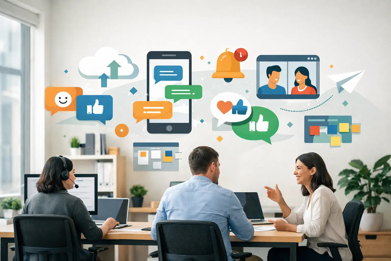
A blank office wall says something, even when nothing is on it. It can feel unfinished, cold, or disconnected from the people working there. That is why office messaging design trends matter right now. The strongest workplaces are using walls, glass, and shared spaces more intentionally - not just to decorate, but to communicate culture, purpose, and identity from the moment someone walks in.
For schools, nonprofits, medical practices, churches, and growing businesses, this shift is especially meaningful. When your environment reflects what you stand for, people feel it. Staff members feel more grounded. Visitors feel more welcomed. Patients, donors, families, and clients get a clearer sense of who you are before anyone says a word.
Office messaging design trends are getting more purposeful
One of the biggest changes in office messaging is that organizations are moving away from generic inspiration. The old approach often relied on filler phrases that looked nice but did little to support the mission of the space. Today, the trend is toward messaging with a job to do.
That might mean a nonprofit displaying a concise mission statement in its lobby, a wellness office using reassuring language in patient areas, or a school placing core values where students and staff see them every day. The message is no longer an afterthought. It is becoming part of how the organization leads, serves, and builds trust.
This does not mean every wall needs text. In fact, too much wording can create visual fatigue. The better approach is selective and intentional. A few well-placed statements often carry more weight than an entire building full of quotes.
Trend 1: Mission-first messaging
Organizations are increasingly designing around what matters most to them rather than what happens to be popular. That is a healthy shift.
Mission-first messaging puts the organization’s purpose at the center of the design. Instead of asking, “What should go on this wall?” teams are asking, “What should people understand or feel in this space?” That question leads to stronger choices.
In a church office, that may be a statement of welcome and care. In a healthcare setting, it may be calming language that supports trust. In a small business, it may be a values wall that reinforces how the team works together. The trend is not about being louder. It is about being clearer.
Trend 2: Branded interiors that feel human
Another of the most visible office messaging design trends is the move toward branding that feels lived-in, not corporate for the sake of looking corporate.
This shows up in color palettes pulled from the brand, typography that matches printed materials, and messaging that sounds like the organization actually speaks. A well-designed office should feel connected to the brand without feeling rigid or overly polished.
There is a balance here. If every surface is covered in logos, the space can start to feel promotional rather than welcoming. But when a brand’s voice and visual identity are translated thoughtfully into wall graphics, glass lettering, and environmental messaging, the result feels cohesive and trustworthy.
Trend 3: Glass graphics that improve privacy and communication
Glass has become one of the most useful surfaces in workplace design. Offices, conference rooms, waiting areas, and entryways often include large glass panels that can feel stark when left untouched. Messaging on glass is trending because it solves more than one problem at once.
It can add privacy without blocking light. It can provide directional cues in a clean, modern way. It can also carry key brand or mission statements in places where people naturally pause and look.
For medical and wellness offices, this trend is especially effective because it helps spaces feel more comfortable and professional at the same time. For ministries, schools, and nonprofits, glass graphics can create a sense of welcome while guiding visitors with clarity.
Trend 4: Values walls with real staying power
Core values displays are not new, but the way they are being designed has changed. The trend now is toward values walls that feel integrated into the environment instead of tacked on as a corporate exercise.
The difference usually comes down to wording and design. Values need to sound authentic to the organization, and they need enough visual presence to be noticed without overwhelming the room. Shorter language often works better than long paragraphs. Strong spacing, readable fonts, and thoughtful placement matter just as much as the words themselves.
When done well, a values wall becomes part of the organization’s daily rhythm. It reminds staff what they are building together. It gives visitors an immediate sense of culture. It can even support hiring and onboarding by making expectations visible from day one.
Trend 5: Calming, people-centered messaging
Not every office needs bold statements. One of the quieter trends is messaging designed to reduce stress and create emotional ease.
This is especially relevant in healthcare, counseling, dental, and wellness environments, where visitors may arrive feeling anxious or uncertain. In these spaces, wording should not feel busy or performative. It should feel steady, clear, and supportive.
Design plays a major role here. Softer contrast, clean lettering, and uncluttered layouts often work better than high-energy treatments. The message may be simple, but the effect can be powerful. A thoughtfully chosen phrase in the right location can help a space feel more reassuring without saying too much.
Trend 6: Custom over cookie-cutter
People can tell when a message belongs in a space and when it was copied from somewhere else. That is why customization continues to lead the market.
Organizations want graphics that reflect their own voice, audience, and layout. A school may need age-appropriate wording and colors that support school spirit. A nonprofit may need a donor wall that honors generosity while staying consistent with its mission. A business may want reception graphics that look polished but still approachable.
This trend also reflects a practical reality. Every building is different. Wall sizes, lighting, paint colors, flooring, and traffic flow all affect how messaging will look in real life. Custom design helps the final result feel intentional instead of forced.
Trend 7: Design that considers installation from the start
One trend that deserves more attention is planning for execution early. Beautiful concepts matter, but so does installability.
The strongest office messaging projects are being designed with real surfaces, dimensions, and application methods in mind from the beginning. That means choosing layouts that fit the wall correctly, selecting materials suited to the surface, and avoiding tiny details that may not read well from a distance.
This is where many organizations benefit from hands-on guidance. Busy office managers and administrators usually do not have time to troubleshoot design files, scale issues, or placement decisions. A thoughtful process helps them move from idea to finished space with more confidence and fewer surprises.
How to choose the right trend for your space
Not every trend belongs in every office, and that is a good thing. The right choice depends on who uses the space, what they need to understand, and how the environment should feel.
If your biggest challenge is a space that feels generic, mission-first messaging may have the greatest impact. If you already have a strong brand but your interior does not reflect it, branded environmental graphics may be the better direction. If privacy and professionalism are both priorities, glass graphics may solve two needs at once.
It also helps to think in zones rather than in one big design move. A lobby may call for a strong first impression. A hallway may be better suited for values or directional messaging. A staff area may benefit from encouraging language that supports culture internally. Different spaces can do different jobs.
What these office messaging design trends really point to
Taken together, these trends reveal something simple but important: offices are being asked to communicate more clearly. People want spaces that feel aligned, thoughtful, and true to the work happening inside them.
That does not require a full renovation. Often, the change comes from using existing walls and glass more wisely. The right words, in the right place, can create clarity where there was emptiness and connection where there was only blank space.
At Wall Words, we see this every day in organizations that want their environment to support the people they serve. The best messaging is not there just to fill a wall. It is there to help the space speak with purpose.
If you are planning updates to your office, start with one question: what should people feel and understand the moment they walk in? That answer is usually the beginning of a design that lasts.