
Printed Graphics Versus Dimensional Letters
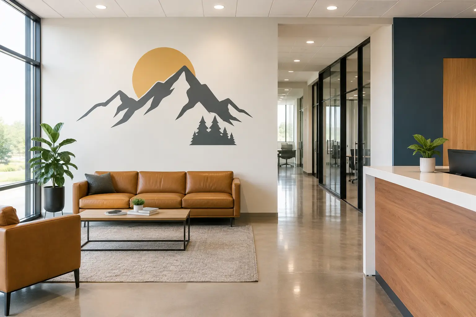
A lobby wall has only a few seconds to make someone feel they are in the right place. A warm welcome, a clear mission, or a reminder of shared values can set that tone before a conversation even begins. When choosing printed graphics versus dimensional letters, the question is not simply which option looks better. It is which one helps your message feel most true to your organization and the people you serve.
Both can create a beautiful, meaningful space. The best choice depends on what you want people to notice, how they move through the room, the character of your wall, and the feeling you hope to create.
The Difference Between Printed Graphics and Dimensional Letters
Printed wall graphics are designs produced in full color on vinyl. They can include photography, illustrations, logos, color blends, textures, maps, detailed artwork, and words. Because the design is printed, it can carry many visual details in one coordinated piece.
Dimensional letters are individual letters, logos, or shapes with physical depth. They stand slightly out from the wall instead of sitting flat against it. Depending on the material and finish, they can feel clean and modern, warm and handcrafted, or polished and professional.
Neither option is automatically more meaningful than the other. A printed mural can share a nonprofit's story through images and impact statistics. Dimensional letters can give a mission statement a lasting, intentional presence in an entryway. The message comes first. The format should support it.
When Printed Graphics Make the Most Sense
Printed graphics are often the right fit when your wall needs to communicate more than words alone. A school might use a colorful hallway graphic with its mascot, school colors, and encouraging messages. A medical office may choose soft nature imagery paired with calming words to help patients feel more at ease. A church can combine a scripture, a meaningful image, and a welcoming design in one visual statement.
They are especially helpful when color is central to your identity. Printed vinyl can reproduce brand colors, photographs, illustrations, and detailed logos in ways dimensional lettering usually cannot. It also gives you room to tell a fuller story without asking visitors to read several separate signs.
Choose printed graphics for detail and flexibility
A printed graphic is a practical choice for a large wall that needs visual energy, an area with a complex logo, or a display that may be updated over time. For example, a donor recognition wall can include names, tiers, icons, and a custom background in a single cohesive design. A printed graphic can also cover more visual ground without requiring every element to be fabricated separately.
Because the material lays flat on the wall, printed graphics can work well in busy corridors, classrooms, waiting rooms, and other spaces where people may pass close by. They create impact without adding physical projection from the surface.
That said, a highly detailed design needs thoughtful planning. Small text, low-contrast colors, or too many messages competing for attention can make a wall harder to read. A strong design leaves breathing room and guides the eye toward what matters most.
When Dimensional Letters Make the Most Sense
Dimensional letters bring a sense of permanence to a message. Their depth catches natural light and creates subtle shadows, giving words a presence that changes as someone walks by. They are often a wonderful choice for reception areas, conference rooms, ministry lobbies, school entrances, and office spaces where a few important words deserve to stand apart.
Think of a nonprofit's mission placed behind the front desk, a set of core values in a team gathering space, or a business name greeting visitors at the entrance. When the message is concise, dimensional letters give it weight without making the wall feel crowded.
Choose dimensional letters for presence and simplicity
Dimensional letters tend to shine when the design is clean and the words are meant to be read from a distance. A logo, organization name, short mission statement, or guiding phrase can feel especially considered in this format.
They are also a good fit when you want texture and contrast. Dark letters on a light wall, white letters on a rich painted surface, or a coordinated logo paired with a simple phrase can create a welcoming focal point. The look is often more architectural than a flat graphic, which can be helpful in polished professional settings.
There are trade-offs. Dimensional letters usually work best with fewer words and simpler artwork. Long paragraphs, tiny names, detailed photographs, and information-heavy displays are generally easier to handle with printed vinyl. Installation also requires careful measuring and placement so every letter is level, evenly spaced, and visually balanced.
Printed Graphics Versus Dimensional Letters: Questions to Ask
The choice becomes clearer when you begin with the experience you want to create. Before selecting materials, look at the wall from the perspective of a first-time visitor. What should they understand or feel? Where will they be standing when they see it? Will they have a few seconds to take it in, or time to pause and read?
Consider these practical questions:
- Does your message need photographs, multiple colors, illustrations, or detailed information?
- Is the wall viewed from across a lobby, up close in a hallway, or from several distances?
- Are you sharing a short, lasting statement or a larger story with several parts?
- Does the room need a calm, simple focal point or a more expressive visual moment?
- Will the design need to change as programs, campaigns, donors, or seasons change?
If your answer centers on detail, color, and storytelling, printed graphics may be the more natural fit. If it centers on a short message, a strong first impression, and physical presence, dimensional letters may be the better choice.
A Thoughtful Combination Can Be the Answer
You do not always have to choose one or the other. Some of the most inviting spaces use both with purpose.
A reception wall might feature dimensional letters for the organization name and a printed graphic for a colorful logo element or supporting design. A school may use dimensional lettering for a core value such as “Belong” or “Kindness,” then add printed graphics nearby with student artwork, school colors, or examples of that value in action. A donor wall can use dimensional headers for major categories and printed elements for names and details.
This approach creates hierarchy. The dimensional pieces tell visitors where to look first. The printed elements help fill in the story. The result can feel layered without becoming overwhelming.
The key is restraint. When every element asks for attention, the wall can lose its message. A thoughtful design team will help decide which words need the strongest presence and which details can live quietly in the background.
Consider Your Wall, Lighting, and Daily Use
The wall itself has a voice in this decision. Smooth, clean walls are generally the easiest surface for both printed vinyl and dimensional lettering. Texture, seams, uneven paint, moisture, frequent cleaning, and strong direct sunlight can all affect the best material and installation approach.
Lighting matters, too. Dimensional letters benefit from light that lets their depth and shadows show naturally. In a dim corner, a high-contrast printed graphic may be easier to see. In a bright, open lobby, dimensional lettering can create a refined focal point without relying on a large field of color.
It is also wise to think about the life of the message. A foundational mission statement may deserve a more permanent dimensional treatment. A seasonal welcome, fundraising campaign, new program, or rotating student message may be better suited to printed vinyl that can be refreshed when the time comes.
Let the Meaning Lead the Material
Budget and timeline are real considerations, and they should be part of the conversation. Printed graphics can be an efficient way to create a large-scale, color-rich display. Dimensional letters involve individual pieces and careful installation, which may make more sense for a smaller number of high-impact words. The right investment is the one that serves your message well and fits the needs of your space.
At Wall Words, the process begins by listening to what you want people to feel when they walk in. A busy office manager, school leader, ministry team, or nonprofit director should not have to figure out every design detail alone. From colors and fonts to wall measurements and installation planning, thoughtful guidance can turn an idea into a space that feels like home for the people who enter it.
Your walls do not need to say everything. They simply need to say the right thing, clearly and with heart.