
Southern California Workplace Graphics That Matter
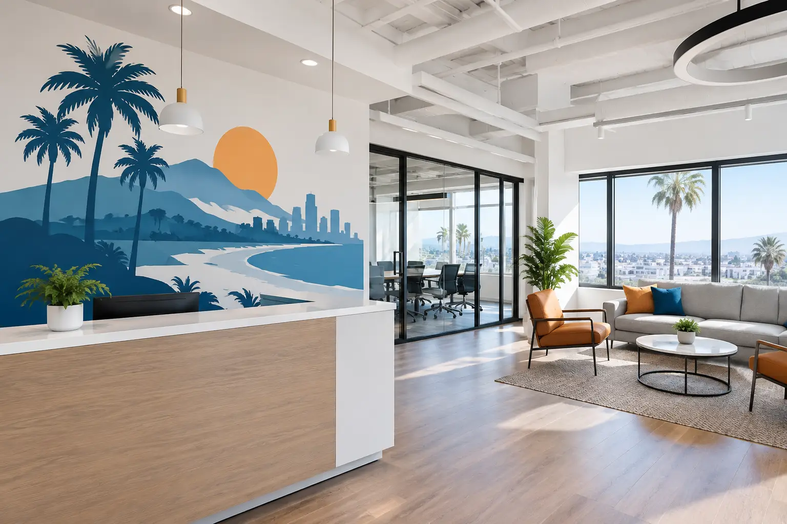
A blank lobby wall can feel like a missed introduction. A crowded reception window can make it harder to find the door. And a break room with nothing but beige paint may say very little about the people who spend their days there.
Southern California workplace graphics give organizations a thoughtful way to change that. The right words, colors, and visuals can help a visitor feel welcome before a conversation begins. They can remind a team what they stand for, make a patient feel more at ease, or help a family understand where to go next.
For busy leaders, the goal is not simply to decorate an office. It is to make the space feel more like the organization itself.
Start With the Feeling You Want People to Have
Before choosing a font, a wall color, or a decal size, consider the first few moments someone spends in your space. What should they understand or feel?
A church lobby may need to feel warm, peaceful, and easy to navigate. A nonprofit office may need to show its mission and the people it serves. A dental or wellness office may benefit from calm wording and gentle visuals that soften a nervous wait. A school may want students to see encouragement, belonging, and pride in their hallways each day.
That feeling becomes a helpful filter for every design choice. If a message is meaningful but difficult to read from across the room, it may not serve the people entering the space. If a graphic is beautiful but feels unrelated to your work, it can leave the room feeling disconnected. The most memorable workplace graphics bring purpose and practicality together.
Where Workplace Graphics Make the Biggest Difference
Not every wall needs a message. Choosing a few high-impact locations often creates a clearer, more intentional experience than trying to fill every available surface.
Entryways and Reception Areas
Your entrance is where people begin forming an impression. A welcome message, logo, mission statement, or simple directional graphic can make a space feel cared for from the start. For organizations with a lot of first-time visitors, window lettering can also clarify which door to use, where to check in, or what services are available.
Keep the message focused. A reception area is rarely the right place for a full page of text. One sincere welcome or a short statement of purpose will usually land more clearly.
Hallways and Shared Spaces
Hallways are ideal for values, milestones, student encouragement, team achievements, or a visual timeline of your organization’s story. These are spaces people pass through repeatedly, so graphics here can reinforce a message over time without demanding too much attention at once.
For a nonprofit, this might mean showing the steps from generosity to impact. For a school, it may be words that encourage perseverance and kindness. For a small business, it could be a values wall that gives employees and visitors a clear sense of what guides the work.
Meeting Rooms and Team Areas
The rooms where people solve problems, make plans, and have difficult conversations can benefit from a visible reminder of shared purpose. Mission statements, core values, or a meaningful phrase can give a team something to return to when the day gets busy.
There is a trade-off here. A large, detailed mission statement may be right for a conference room where people can pause and read it. In a smaller team space, a few well-chosen words may have more impact. The message should fit both the room and the way people use it.
Windows, Doors, and Wayfinding Areas
Vinyl lettering and decals on glass can help a workplace feel organized without adding bulky signs. Office names, hours, check-in directions, privacy frosting, and safety reminders can all be handled with clean, purposeful window graphics.
In Southern California, where bright sunlight is part of daily life, placement matters. Strong natural light can make a light-colored design harder to see on glass, while a darker color or frosted vinyl may offer better contrast. A thoughtful design process considers visibility at different times of day, not just how a graphic looks in a photo.
Choosing the Right Type of Graphic
The best material depends on the message, the surface, and how long you expect the graphic to stay in place. Custom vinyl lettering is a natural choice for names, scripture, values, quotes, and mission statements because it creates a clean painted-on look without the mess of paint.
Wall decals work well for more detailed designs, including logos, icons, illustrations, and colorful branded elements. Printed wall graphics are especially helpful when a design includes photography, multiple colors, or a visual story that cannot be created with single-color lettering alone.
The finish matters, too. Matte graphics often feel softer and reduce glare, which can be helpful in spaces with many windows. Gloss finishes can make colors appear more vivid, though they may reflect more light. A trusted design partner can help you weigh those small details before production begins.
Make the Message Easy to Read and Easy to Feel
Beautiful design should never make a message harder to understand. Readability is an act of welcome, especially in workplaces serving patients, families, students, donors, or community members.
Choose a font that fits your organization’s personality while remaining clear from the expected viewing distance. Script fonts can feel personal and warm, but they are usually best for short phrases. Clean, simple fonts often work better for directions, values, and longer messages. Size matters just as much as style. A phrase meant to be read from ten feet away needs more room than one placed beside a desk.
Color should support the mood and the message. Brand colors can create consistency, but they should still provide enough contrast against the wall. Soft neutral walls may call for a deeper color. A dark accent wall may need white, cream, or another light tone for clear visibility. Ordering color samples can be worthwhile when lighting or paint colors are uncertain.
Plan for Real-Life Installation
A graphic is only as successful as its placement. Before finalizing a design, measure the usable wall area and notice anything that affects the layout: light switches, vents, furniture, baseboards, door frames, and artwork that will remain nearby.
Think about the viewer’s path through the room. A mission statement behind a reception desk may be partially blocked by a monitor. A hallway message may need to begin at eye level rather than too high above a chair rail. For window lettering, confirm which side of the glass people will view first.
Many vinyl graphics are designed for straightforward installation, but larger pieces, multi-part layouts, and high-visibility spaces may call for extra guidance. It is always better to ask questions early than to rush the final step. Clear instructions, careful surface preparation, and a second set of hands can make installation feel much more manageable.
Let Your Space Tell One Connected Story
The strongest Southern California workplace graphics do not have to match perfectly, but they should feel like they belong together. A visitor should be able to move from the entryway to a hallway to a meeting room and recognize the same care, voice, and purpose.
That can be as simple as repeating a few brand colors, using the same font family, or carrying one central message through several spaces. A donor wall may connect to a mission statement nearby. A welcome message may echo language used in a values display. These small connections help people feel that the space was created with intention.
At Wall Words, that begins with listening to what your organization wants people to carry with them after they leave. Your wall, your designs, and your story deserve more than a one-size-fits-all answer.
A meaningful workplace does not need to say everything at once. Start with the message that matters most, give it a place to be seen, and let it remind people why they are there.