
Welcome Wall for Churches That Feels Warm
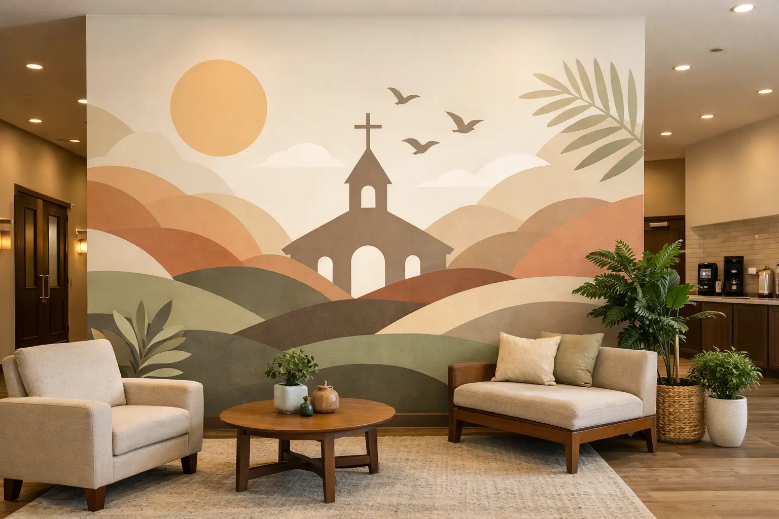
A first-time guest usually decides how a church feels before anyone says hello. They notice the entryway, the signage, the tone of the space, and whether the environment feels clear, thoughtful, and inviting. That is why a welcome wall for churches is more than decor. It is one of the simplest ways to communicate, right away, that people matter here.
When done well, a welcome wall creates calm, reduces uncertainty, and reinforces your church’s identity. It can point people where to go, reflect your mission, and make a large foyer or hallway feel intentional instead of unfinished. It can also serve regular attenders, volunteers, and families every week by making the church easier to navigate and more connected to its purpose.
What a Welcome Wall for churches should look like
A beautiful wall is not automatically an effective one. In a church setting, the best Welcome Walls balance emotion and function. They help people feel received, but they also answer practical questions.
For some churches, that means a bold greeting with the church name and a warm phrase near the main entrance. For others, it means combining that greeting with service times, children’s check-in directions, or a short mission statement. It depends on the building, the flow of traffic, and who uses the space most.
A Welcome Wall should first make the space feel approachable. Large blank walls can feel cold, especially in entry areas with hard floors, high ceilings, or minimal furnishings. Thoughtful wall graphics add warmth without creating clutter. They give the room a voice.
It should also support wayfinding. Guests often walk into a church with a quiet list of questions: Where do I check in my kids? Where is the sanctuary? Where do I go for coffee, restrooms, or information? If your welcome wall helps answer even one or two of those questions, it is doing real work.
Just as importantly, it should reflect who you are. A traditional church may want a more timeless design with classic typography and a restrained color palette. A modern church plant might choose cleaner lines, larger type, and more contemporary branded messaging. Neither is better. The right choice is the one that feels true to your church and clear to the people walking in.
The elements that make it work
The strongest Welcome Walls usually include a few carefully chosen pieces rather than trying to say everything at once. A simple greeting, your church name or logo, and one supporting message are often enough.
That supporting message might be a Mission Statement, a short phrase about belonging, or a directional cue such as New Here? Start at the Welcome Desk. In some spaces, scripture can also fit beautifully, especially if it reinforces hospitality, peace, or community. The key is restraint. If a wall tries to function as a bulletin board, a sermon, and a map all at once, people may stop reading altogether.
Scale matters more than many churches expect. A phrase that looks substantial on a laptop screen can disappear on a twenty-foot wall. Lettering should be sized for the actual viewing distance, and the layout should be designed around the architecture, not just the wording. Windows, doors, furniture, and traffic patterns all affect what will feel balanced.
Material choice matters too. Vinyl lettering, church logos, and custom wall graphics are popular because they create a clean, painted-on look without the cost or permanence of a mural. They work especially well for churches that want a polished result, manageable installation, and the flexibility to customize fonts, colors, and sizing.
Where a church Welcome Wall works best
Most people think first of the main lobby, and for good reason. That is usually the highest-impact location because it shapes the first impression for guests and the weekly experience for members. But it is not the only place a welcome wall can work.
A narrower hallway leading from the entrance to the sanctuary can become a strong transition space with a simple greeting and directional support. A children’s ministry check-in area can use a welcome wall to reassure families and make the process feel more organized. A fellowship hall entrance can carry messaging that reinforces community and connection.
If your church has multiple entry points, the best solution may not be one large wall. It may be a primary welcome wall in the main lobby and smaller supporting graphics in secondary locations. This is where custom design matters. The goal is not to repeat the same graphic everywhere. It is to build a clear, consistent experience from one space to the next.
Common mistakes to avoid
One of the most common issues is putting too much text on the wall. Churches often want to include every ministry, every service time, and every part of their mission all in one place. The heart behind that is understandable, but a welcome wall works best when it communicates quickly.
Another mistake is treating the wall as separate from the rest of the room. Even the best wording can feel off if the colors fight the surrounding finishes or the placement ignores how people actually move through the space. Design should respond to the environment, not compete with it.
There is also a difference between trendy and lasting. A style that feels current today may not suit your church three years from now. That does not mean your wall should be boring. It simply means your choices should be grounded in your identity rather than short-term design trends.
Finally, churches sometimes underestimate installation. A large wall graphic can look simple, but precision matters. Crooked alignment, poor spacing, or a layout that is too high or too low can weaken the entire effect. Planning ahead saves time and helps the finished wall feel intentional.
How to plan the right message
If you are starting from scratch, begin with one question: What do we want someone to feel in the first ten seconds?
That answer will shape everything else. If you want people to feel peace, your design may lean quieter and more spacious. If you want energy and friendliness, the message and scale may be more bold and upbeat. If you want clarity above all, directional language may need to carry more weight.
After that, think about what people need to know immediately. This is where many churches find the right balance between welcome and function. You may not need a full list of information on the wall, but one line that points guests in the right direction can make the whole building feel easier.
It also helps to think in layers. The welcome wall is the opening message, not the only message. A church can use its lobby wall to set the tone, then use smaller signs, window graphics, or ministry-specific walls elsewhere to provide more detail. That approach keeps the main entry clean while still supporting the full visitor experience.
Custom design makes a difference
Church spaces vary widely. Some have grand foyers with lots of natural light. Others have smaller, multi-use entryways that need every inch to work harder. That is why off-the-shelf decor often falls short. A custom welcome wall for churches can be sized, worded, and styled around the exact space it needs to serve.
Customization also helps churches stay true to their identity. Your wall, your message, your colors, your fonts. A welcome wall should not feel borrowed from someone else’s ministry. It should feel like your church at its best - clear, warm, and ready to receive people well.
For busy ministry leaders and administrators, the process matters too. Design support, proofing, color guidance, and installation help can turn what feels overwhelming into a smooth project. A good partner helps you make confident choices without overcomplicating the experience.
At Wall Words, that kind of support is part of what makes a project successful. The goal is not just to fill a blank wall. It is to help the space communicate purpose in a way that feels natural, polished, and true to your church.
A welcoming church starts with people, of course. But the environment can either support that effort or make it harder. When your walls reflect care, clarity, and intention, guests feel that before the conversation even begins.