
Wellness Clinic Branding Wall Example Ideas
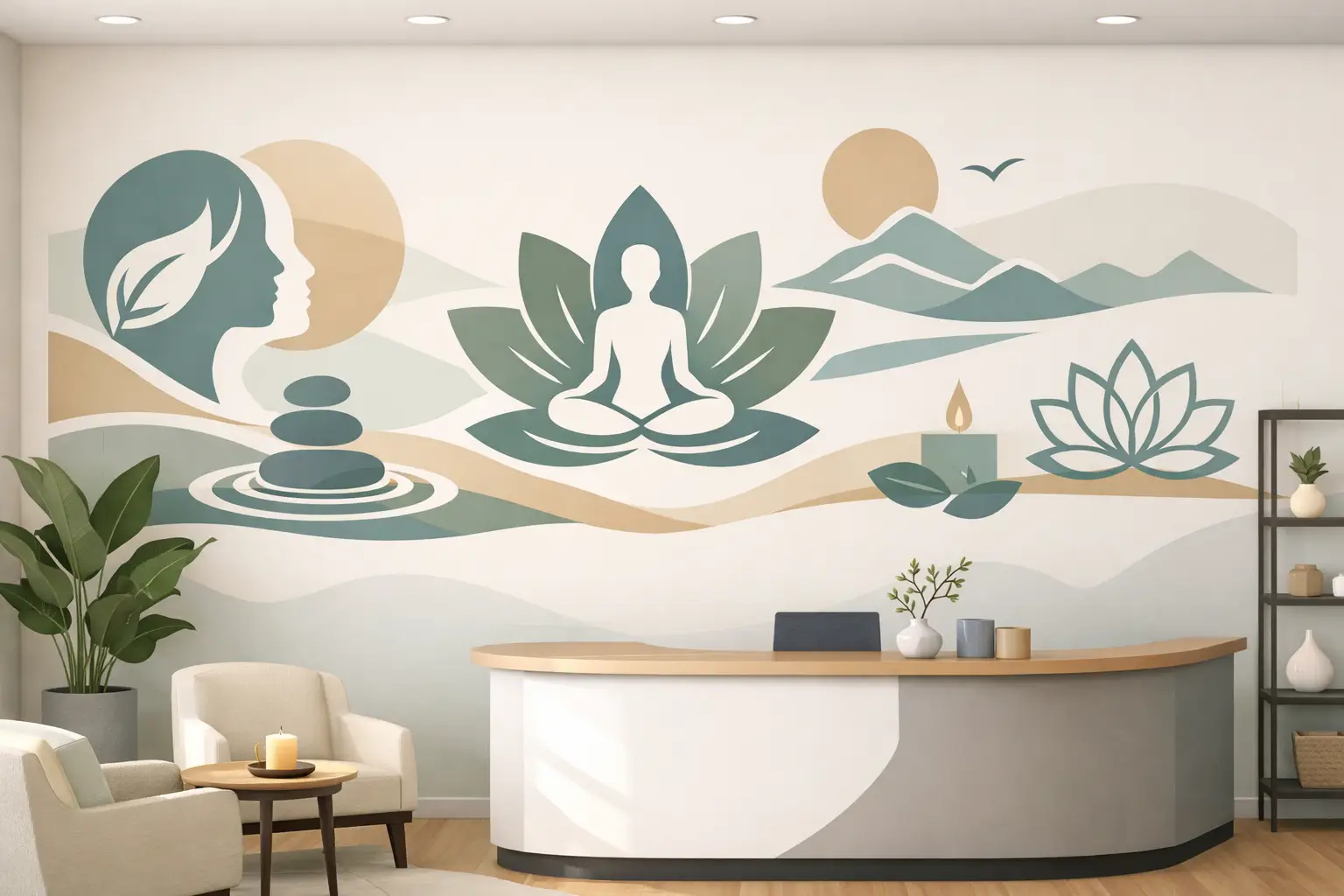
A blank reception wall says something, even when nothing is on it. In a wellness clinic, that silence can feel unfinished, generic, or oddly cold. A thoughtful wellness clinic branding wall example shows the opposite - that your space is intentional, calming, and aligned with the care you provide before a patient ever reaches the front desk.
That matters more than many clinic owners expect. People walk into wellness spaces looking for reassurance. They want to feel they are in capable hands, but they also want warmth, clarity, and a sense that the practice has a real point of view. The right wall graphic can do that quietly and consistently every day.
What a wellness clinic branding wall example should accomplish
A strong branding wall is not just a logo placed larger. It should help patients understand who you are, what kind of experience they can expect, and what your clinic values. In most wellness offices, that means balancing professionalism with comfort.
If the wall leans too corporate, the space can feel sterile. If it leans too decorative, it can feel less credible. The best solution usually sits in the middle: clean branding, restrained color, clear messaging, and materials that feel polished without becoming flashy.
A good branding wall often does three jobs at once. It reinforces recognition for returning patients, creates trust for first-time visitors, and gives the office a more complete visual identity for photos, referrals, and day-to-day culture. When your interior reflects your mission, patients feel that consistency.
A practical wellness clinic branding wall example
Imagine a clinic reception area with a soft neutral wall behind the front desk. Centered on that wall is the clinic logo in dimensional lettering or precision-cut vinyl, depending on budget and desired finish. Beneath the logo sits a short brand statement in smaller lettering, something calm and clear such as “Personalized care for whole-body wellness” or “Helping you feel better, move better, and live well.”
To one side, a simple vertical design element carries the brand palette - maybe a muted sage, soft blue, warm sand, or charcoal accent. On the other side, a subtle icon set or line motif reflects the clinic’s specialty without overwhelming the wall. If the office focuses on chiropractic care, functional medicine, IV therapy, hormone health, physical recovery, or holistic wellness, those cues can be integrated carefully.
The finished wall does not need to be large to be effective. What makes it work is proportion, readability, and tone. The message is visible from the entrance, the logo is crisp, and the materials feel intentional rather than improvised.
The layout choices that make the biggest difference
Most clinics do best with one focal point rather than several competing features. A branding wall should guide the eye quickly. Patients should not have to stand in the lobby sorting through five messages at once.
Horizontal layouts tend to work well behind a reception desk because they mirror the architecture of the space. Vertical layouts can be helpful in narrower entry areas or side walls where you want to draw attention upward. If your clinic has high ceilings, a slightly taller composition can make the office feel refined and balanced.
Scale matters too. One common mistake is choosing lettering that is too small. What looks fine on a proof can disappear in a real room. Another is oversizing the logo so aggressively that the wall feels like signage instead of part of a healing environment. It depends on viewing distance, ceiling height, and how much natural light the space gets.
Wording for a wellness clinic branding wall example
In many cases, less wording works better. Your clinic name and logo may be enough if your branding is already clear. But if your name is broad or your services are not immediately obvious, a short supporting line can add clarity.
The best wording sounds grounded and human. It should match the way you actually speak to patients. Phrases built around healing, balance, movement, vitality, restoration, or personalized care often fit naturally. Still, every clinic is different. A sports recovery practice may want language that feels energetic and performance-focused, while a women’s wellness clinic may prefer wording that feels reassuring and nurturing.
Avoid trying to fit your entire service menu on the wall. Patients do not need a paragraph while checking in. A branding wall is strongest when it communicates identity first. Detailed service information can live elsewhere in the office.
Materials and finishes that fit the wellness setting
Vinyl lettering and custom wall graphics are often the smartest place to start because they offer a clean look, flexible sizing, and a custom feel without requiring a full renovation. They also make it easier to match brand colors and typography accurately.
For some clinics, a matte finish feels softer and more upscale than glossy materials. Dimensional lettering can add depth and visibility, especially in modern spaces with minimal decor. Frosted graphics on glass can also extend the brand beyond the main wall while adding privacy to treatment rooms or consultation areas.
There is always a trade-off between visual impact, budget, and permanence. A fully layered installation with multiple materials may create a premium look, but a simpler design can still feel elevated when the layout and typography are handled well. Good design carries more weight than expensive excess.
Color choices that calm without fading away
Wellness clinics often gravitate toward soft greens, blues, creams, and grays for good reason. These colors feel peaceful and clean. But a wall that is too pale can disappear, especially under bright office lighting.
The better approach is usually contrast with restraint. If your wall color is light, use a darker logo or statement color for readability. If your brand palette is muted, consider layering tones so the design still has depth. Even a simple monochrome installation can feel beautiful when spacing, font choice, and scale are right.
This is one area where samples help. Colors shift under fluorescent lighting, natural daylight, and warm LED fixtures. What feels calm in a design mockup may look washed out in person.
Where to place the branding wall
The most obvious location is behind the reception desk, and often that is still the best one. It creates an instant focal point and gives patients a clear visual anchor upon arrival. But not every clinic has the same flow.
If your check-in area is small, the main branding wall may work better in the entry corridor, waiting room, or opposite the front door where it is visible the moment someone walks in. In larger spaces, a primary branding wall can be paired with smaller supporting graphics that carry the same visual language into hallways, consultation rooms, or wellness product areas.
Consistency matters here. If the reception wall feels elegant but every other space is blank, the brand story can stop short. A few connected elements often create a more complete experience.
Why customization matters more than copying trends
You can find a lot of inspiration online, but the most effective wellness clinic branding wall example is one built around your clinic, not a generic spa aesthetic. A branding wall should reflect how you care for people, what your patients need to feel, and how your practice wants to be remembered.
That is why customization matters. Your fonts, colors, spacing, wording, and installation choices should fit your actual environment. A small family wellness office may need something warm and approachable. A premium med spa may want a sharper, more editorial look. A multidisciplinary clinic may need branding that bridges several services without becoming visually cluttered.
This is also where hands-on design support makes the process easier. Many clinic owners know the feeling they want, but not how to translate it onto a wall. That is completely normal. With the right guidance, even a rough idea can become a polished result that feels true to the brand.
What to prepare before ordering
Before moving forward, it helps to gather a few basics: your logo files, brand colors, wall measurements, photos of the space, and a sense of what patients should feel when they enter. Those details shape everything from size and placement to material recommendations.
You should also think through installation. Some clinics want a quick, simple application with minimal disruption. Others are planning a broader office refresh and may want multiple graphics installed together. Neither approach is better - it depends on your timeline, budget, and how much transformation you want in one phase.
For clinics that want a polished result without adding complexity, working with a partner that offers custom design support, production, and clear installation guidance can save time and reduce stress. That is especially helpful when you need the finished wall to feel branded, not just decorated.
A wellness clinic does not need a dramatic remodel to feel more thoughtful, trustworthy, and complete. Sometimes the shift starts with one wall, the right words, and a design that helps people feel cared for the moment they arrive.