
Wellness Clinic Design Trends That Build Trust
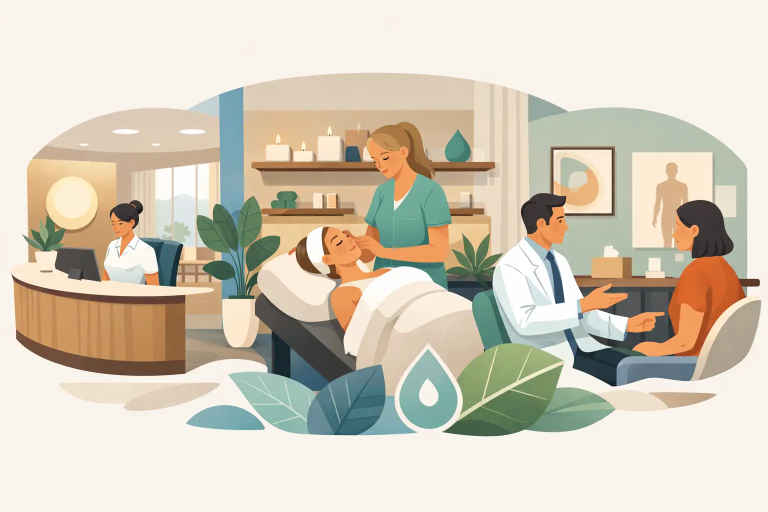
A patient starts forming an opinion before the first appointment begins. The view from the parking lot, the words on the entry door, the clarity of the check-in area, and even a blank hallway all send a message. The strongest wellness clinic design trends recognize that the physical environment is part of the patient experience, not an afterthought once the furniture is in place.
For wellness clinics, medical spas, counseling offices, chiropractic practices, dental offices, and other patient-centered spaces, thoughtful design does more than look polished. It can reduce uncertainty, make navigation easier, and help people feel they are in capable, caring hands. The goal is not to make every clinic look the same. It is to create an environment that reflects the care your team provides.
Wellness Clinic Design Trends Start With Emotional Clarity
The most meaningful trend is a shift away from spaces that feel purely clinical. Patients still want professionalism and cleanliness, but they also want warmth. They may arrive feeling uncomfortable, rushed, hopeful, or nervous. A calm environment acknowledges those feelings without becoming overly themed or distracting.
This often shows up in a softer visual approach: natural color palettes, simple typography, warm wood or neutral finishes, plants, and fewer competing messages. Wall graphics belong in this picture because they can add personality without requiring a full renovation. A carefully chosen phrase, a refined logo treatment, or a short explanation of your approach can bring life to an otherwise plain wall.
The trade-off is restraint. Filling every available surface with motivational quotes or promotional language can make a clinic feel busy at the exact moment patients need visual rest. Choose a few places where messaging will have the most impact, then give those words room to breathe.
Design for the Feeling You Want Patients to Carry
Before choosing colors, decals, or decor, ask a more useful question: How should someone feel as they move through this space? Reassured? Seen? Energized? Safe? Informed?
A physical therapy practice may want to communicate momentum and encouragement. A counseling office may favor privacy, peace, and gentle reassurance. A family wellness practice may need to feel welcoming to adults and children at the same time. The answer should guide the language, scale, placement, and color of each graphic.
A reception wall is a natural place for a concise mission statement or brand promise. In a treatment corridor, calming words or subtle directional graphics may be more appropriate. In a staff area, core values can remind the team what unites their work each day. Your wall, your designs, but every message should earn its place.
Natural Materials and Biophilic Details Create Warmth
Nature-inspired design continues to shape wellness spaces because it offers a visual break from the hard, sterile feel of traditional medical interiors. This does not require a major construction project. A clinic can introduce warmth through earthy colors, leaf or botanical motifs, nature photography, textured finishes, and graphics that support the overall palette.
For example, frosted glass graphics can create privacy in consultation rooms while preserving natural light. A soft, tone-on-tone botanical pattern on a glass partition may feel more welcoming than a completely opaque barrier. Vinyl lettering in muted greens, clay tones, warm grays, or deep blue can complement natural finishes while keeping the message easy to read.
The key is to use nature as a supporting element, not a costume. A few intentional visual details feel elevated. Too many patterns, materials, and colors can compete with the calm you are trying to create.
Clear Wayfinding Is Becoming Part of the Brand Experience
Patients should not have to guess where to check in, which door leads to an exam room, or where to find the restroom. Clear wayfinding is one of the most practical wellness clinic design trends because it lowers friction for visitors and saves staff from repeating directions throughout the day.
Good wayfinding starts with simple language. Use familiar words such as Check-In, Treatment Rooms, Restroom, Consultation, and Exit. Keep typefaces readable from a reasonable distance, and create a consistent visual system across doors, walls, and glass. If your logo or brand colors are part of the design, use them with purpose rather than placing the logo everywhere.
Vinyl door lettering and wall decals are especially useful for this work because they can be customized to fit your space and updated more easily than permanent signs. They also allow clinics to make practical improvements without closing rooms or taking on a costly remodel.
Accessibility deserves careful consideration here. Contrast, text size, placement, and required signage standards can vary by building and local regulations. Design can support accessibility, but clinics should confirm applicable requirements with the appropriate local professionals before producing signs. A beautiful sign is only successful if the people who need it can use it.
Branded Glass Is Working Harder Than Ever
Glass doors, sidelights, and interior partitions are common in modern clinics, but untreated glass can create challenges. It may leave rooms feeling exposed, make navigation unclear, or simply miss an opportunity to reinforce the brand.
Custom printed graphics, frosted vinyl, and cut vinyl lettering can help glass surfaces serve several purposes at once. They can establish privacy, identify rooms, improve visibility, and create a cohesive visual experience from the entrance through the treatment areas. A logo on the front door can create a confident arrival point. Privacy bands on consultation-room glass can be functional while carrying a subtle pattern or clinic name.
Consider the patient’s perspective. If a person is sitting in a waiting room, what do they see? If they are walking toward a room for the first time, is the destination obvious? Glass graphics should answer those questions quietly and clearly.
Values and Education Are Moving From Brochures to Walls
Patients increasingly want to understand the people and philosophy behind their care. That does not mean a wall needs to explain every service or display a long list of credentials. It means a clinic can use a few well-chosen words to make its approach more visible.
A concise mission statement near reception may explain the heart of your practice. A values wall in a staff hallway can reinforce the behaviors that shape patient care. In a treatment or consultation area, a simple educational graphic can help patients understand a process or know what to expect next.
Keep educational content focused. If it needs several paragraphs, it may be better suited to a handout or conversation with a provider. Walls are strongest when they communicate one idea quickly. They should support the human interaction, not replace it.
For clinics with multiple services, visual hierarchy matters. Choose one primary message for each area, then use smaller supporting information only where it helps patients make a decision or feel prepared. This approach feels more confident than trying to communicate everything at once.
Flexible Graphics Support Growth Without Major Renovation
Wellness practices change. A new provider joins the team. A room shifts from consultations to treatments. A service line expands. A seasonal campaign comes and goes. Design trends are moving toward flexible elements that can evolve with the clinic rather than locking every message into permanent construction.
Custom vinyl lettering and decals are a practical fit for this need. They can be created to match existing branding, fit unusual wall dimensions, and bring clarity to spaces that were not originally designed for patient communication. Whether you need one doorway label or a coordinated set of interior graphics, customization makes a space feel intentional rather than patched together.
Material choice still matters. A temporary campaign may call for a different solution than a long-term mission statement. High-traffic areas need durable, easy-to-clean graphics. Text placed near seating or doors should account for scuffs, cleaning routines, and frequent touchpoints. Planning for real-life use protects the finished look.
Make the Waiting Area More Than a Waiting Area
The waiting room sets the emotional tone, yet it is often treated as a holding area. Current design thinking gives it a more active role: a place to orient, reassure, and reflect the quality of care patients are about to receive.
Start with the wall patients see first. Instead of defaulting to generic decor, consider a custom brand statement, a calm visual pattern, or a short message that reflects your care philosophy. A wellness clinic focused on whole-person care might use language centered on listening, partnership, or progress. A sports recovery practice may choose messaging that feels motivating but not aggressive.
Avoid putting sensitive health claims, detailed pricing, or dense service descriptions in the waiting area. Patients may be sharing the space with others, and not every message needs to be public. The best wall design creates a welcoming first impression while allowing the staff to guide more personal conversations.
At Wall Words, the design process can begin with something as simple as a phrase, a logo, a color sample, or a photo of a blank wall. From there, custom graphics can be shaped around the clinic’s goals, space, and patient experience.
A clinic does not need a complete remodel to feel more caring, organized, and memorable. Start with the moment that currently feels unclear or impersonal, then give that space words and visuals that reflect the care people came to find.