
7 Wellness Office Branding Trends to Watch
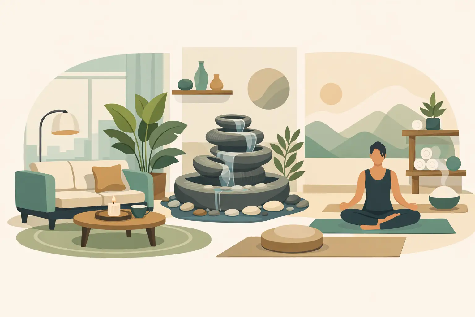
A wellness office can lose trust before a patient ever reaches the front desk. If the space feels cold, cluttered, or generic, people notice it right away. That is why wellness office branding trends are moving beyond logos and brochures and into the physical environment itself, where walls, glass, color, and messaging do quiet but important work every day.
For wellness clinics, therapy practices, chiropractic offices, med spas, dental offices, and holistic care spaces, branding now has a bigger job. It needs to reassure people, reduce stress, and reflect the kind of care they expect to receive. The strongest spaces are not the flashiest ones. They are the ones that feel intentional from the moment someone walks in.
Why wellness office branding trends matter more now
Patients and clients are paying attention to experience in a way they did not a few years ago. They compare providers not only on care, but also on comfort, professionalism, and how a space makes them feel. A calming environment can support confidence before an appointment begins. A confusing or impersonal one can quietly create tension.
This is also a practical branding shift. Many offices do not want the cost or disruption of a full renovation, but they still need their interiors to feel updated and aligned with their mission. That is where custom wall graphics, vinyl lettering, privacy film, and branded environmental messaging have become especially valuable. They can reshape perception without requiring construction.
1. Calming brand expression is replacing clinical blankness
One of the clearest wellness office branding trends is the move away from spaces that look sterile for the sake of looking professional. Patients still want clean and polished, but they also want warmth. Soft neutrals, muted greens, earthy blues, and natural textures are showing up more often because they feel grounded and restorative.
This does not mean every wellness office should look identical. A pediatric therapy clinic may need brighter, more upbeat visuals than a med spa or counseling center. The point is not to copy a palette. It is to choose colors and finishes that reflect your type of care while helping people settle into the space.
Wall messaging plays a role here too. Large blocks of text can feel overwhelming, but a thoughtfully placed phrase, brand promise, or simple welcome statement can make the environment feel more human.
2. Mission-based messaging is becoming part of the brand
Patients want to know what kind of care philosophy they are walking into. That is why many wellness spaces are bringing their values into visible parts of the office rather than keeping them buried on a website. Mission statements, care principles, and concise brand messages are appearing in lobbies, hallways, treatment rooms, and staff spaces.
This works especially well when the wording is clear and restrained. A short statement about compassionate care, whole-person wellness, or patient-centered support can communicate far more than decorative art that says nothing about the practice itself.
What this looks like in real spaces
In a chiropractic office, that might mean a wall graphic that explains the practice's approach to mobility and long-term health. In a counseling center, it may be a gentle statement that affirms safety, dignity, and support. In a dental office, it could be messaging that helps nervous patients feel more at ease before treatment.
When messaging is custom and placed with intention, it becomes part of the experience instead of extra decoration.
3. Privacy features are being designed to support the brand
Privacy is functional, but it also shapes perception. Frosted glass, etched-look vinyl, and branded privacy film are becoming more common because they solve a real need while contributing to a polished, cohesive look.
This is one of the most practical wellness office branding trends because it balances appearance with patient comfort. Reception areas, consultation rooms, and glass partitions can feel exposed if they are left untreated. Privacy graphics soften that experience while reinforcing the office identity.
There is a trade-off here. Too much coverage can make a space feel closed off or dark, while too little may not provide enough discretion. The best approach depends on layout, lighting, and how the room is used. Good design solves for privacy without making the office feel hidden or heavy.
4. Wayfinding is becoming part of the patient experience
Nobody feels calmer when they are trying to guess where to go. Branded directional graphics are becoming more thoughtful in wellness environments because they reduce friction. Clear suite numbers, room labels, check-in instructions, and directional cues help patients move through the office with less stress.
This does not need to feel institutional. In fact, the best wayfinding systems feel almost invisible because they match the office style so naturally. Consistent fonts, simple icons, and clean placement can make an office easier to navigate while still feeling warm and elevated.
For practices with multiple providers or services, this matters even more. If you offer massage therapy, aesthetics, primary care, and consultation spaces under one roof, thoughtful signage helps the brand feel organized and trustworthy.
5. Local personality and authenticity are standing out
Another shift in wellness office branding trends is a move away from generic stock-style design. Offices want spaces that feel true to their audience, their region, and their approach to care. That could mean incorporating local references, nature-inspired imagery, or language that sounds like the team who actually works there.
People can tell when a space was designed from a template. They can also tell when it reflects real thought. Custom environmental graphics make that difference visible.
This is especially important for independent practices trying to distinguish themselves from large chains. A smaller office may not have a giant marketing budget, but it can still create a memorable environment with intentional wall design, branded glass, and clear messaging that reflects its personality.
6. Staff culture is showing up behind the scenes
Branding is not only for patient-facing areas anymore. Many wellness offices are using interior graphics in break rooms, team workspaces, and staff corridors to reinforce values and culture internally. That may sound secondary, but it matters.
A strong internal environment reminds employees what the practice stands for and why their work matters. It can support consistency, morale, and a stronger sense of shared purpose. In service-driven fields like healthcare and wellness, that internal alignment often shows up in the patient experience.
This does not mean covering every wall with slogans. Usually, less is better. A few meaningful statements, visually well executed, can do more than a crowded wall full of disconnected phrases.
7. Flexible branding updates are beating expensive remodels
Not every office is ready for a full redesign, and many do not need one. One reason these wellness office branding trends are gaining traction is that custom graphics offer a more flexible way to improve a space. Offices can refresh a lobby, add privacy to glass, update service menus, or install branded messaging in phases.
That matters for growing practices. If you are expanding services, hiring new providers, or refining your brand position, your office needs to keep up. Environmental graphics make it easier to evolve without tearing everything out and starting over.
Where to start if your space feels outdated
Start with the areas patients notice first. Usually that means the entry, reception area, waiting room, and any glass surfaces that need privacy or branding. Then look at what your walls are saying now. If the answer is not much, that may be the opportunity.
A strong first phase might include a welcome graphic, a mission or values wall, branded frosted glass, and simple wayfinding. Those updates often create a noticeable difference because they improve both appearance and clarity.
How to choose trends that fit your office
Not every trend belongs in every space. A med spa may benefit from a refined, minimalist look, while a family wellness practice may need a warmer and more approachable tone. The right choice depends on your audience, your services, and how you want people to feel when they walk through the door.
The best question is not, what is popular right now? It is, what supports trust in our specific environment?
That is where customization matters. Fonts, colors, scale, wording, and placement all shape the final result. Even a beautiful graphic can miss the mark if it does not fit the office flow or the emotional tone of the practice. Thoughtful branding should feel natural, not forced.
For busy office managers and practice owners, that is often the real value of working with a team that can guide the process from design through production. It keeps the project clear, manageable, and aligned with the bigger purpose of the space.
A wellness office does not need to be extravagant to be memorable. It needs to feel calm, clear, and true to the care being offered there. When your walls, glass, and messaging reflect that purpose well, people feel it almost immediately.