Typography as Leadership: The Silent Impact of Font Choice in Professional Decals


In the world of corporate interior design, every element in a room communicates a message. The color of the carpet, the height of the ceilings, and the placement of desks all contribute to a company’s atmosphere. However, one of the most overlooked yet psychologically potent elements is typography. When a business chooses a decal for wall placement, they are not just selecting words; they are selecting a voice. Typography is a form of non-verbal leadership that dictates how employees and clients perceive the authority, stability, and innovative spirit of a brand.
At Wallwords, we have seen how the right font can transform a simple mission statement into a powerful call to action. Whether you are decorating a high-tech startup hub or a traditional corporate headquarters, understanding the "personality" of fonts is essential for creating a space that inspires confidence.
The Psychology of Font Families in the Workplace
Typography is not merely about aesthetics; it is about cognitive processing. Our brains associate specific letter shapes with established societal roles. When you choose inspirational wall decals for office environments, you must ensure the visual style aligns with the message of the quote.
The Authority of Serif Fonts
Serif fonts are characterized by the small decorative strokes, or "feet," at the ends of the character lines. Times New Roman, Garamond, and Baskerville are classic examples. In a professional setting, serifs communicate tradition, reliability, and institutional knowledge. A law firm or a financial institution in California might choose a serif decal for wall installations to signal that they are rooted in history and can be trusted with sensitive matters.
The Innovation of Sans-Serif Fonts
Sans-serif fonts, such as Helvetica, Arial, and Futura, lack the decorative feet of their predecessors. These fonts are often associated with modernity, cleanliness, and efficiency. They are the "workhorses" of the tech world. If your goal is to promote a culture of transparency and forward-thinking, sans-serif inspirational wall decals for office common areas are the ideal choice. They suggest a company that is streamlined and focused on the future.
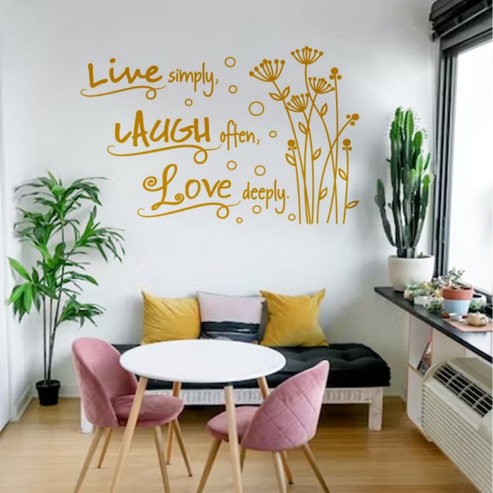
The Creativity of Script and Display Fonts
Script fonts mimic human handwriting. While they should be used sparingly to maintain readability, they are excellent for adding a "human touch" to a cold corporate environment. They suggest approachability and artisanal quality. However, a creative agency must balance these with more stable fonts to ensure the office does not feel chaotic.
Typography and the California Corporate Landscape
California is a global leader in both technology and design. From the high-rises of major metropolitan areas to the creative pockets in Costa Mesa, the standard for visual communication is incredibly high. In a city like Costa Mesa, which is home to some of the most prestigious design firms and retail concepts in the world, a poorly chosen font can make a business look amateurish.
When local businesses in Costa Mesa look to upgrade their interiors, they often turn to Wallwords to ensure their branding remains consistent across all mediums. If your digital brand uses a specific modern font, your physical "decal for wall" applications must match that weight and style. Inconsistency in typography can lead to a subconscious "brand friction" where clients feel something is "off" about the professional presentation, even if they cannot name the specific issue.
Hierarchy and the Art of the "Statement Wall"
A common mistake in office decorating is giving every word the same visual weight. Effective leadership requires a clear hierarchy of information, and your office decals should reflect this.
Scale and Impact
The most important part of your message should be the largest. If you are installing inspirational wall decals for office hallways, the "Core Value" (e.g., INTEGRITY) should be in a bold, heavy weight, while the supporting explanation can be in a lighter, smaller font. This guides the eye and ensures the most important message is absorbed even by someone walking quickly to a meeting.
Kerning and Letter Spacing
The space between letters, known as kerning, can drastically change the "vibe" of a word. Wide letter spacing suggests luxury, breathing room, and high-end positioning. Tight letter spacing suggests urgency, density, and power. At Wallwords, our custom design tools allow you to adjust these technical aspects so your decals look like they were painted by a professional sign writer rather than just being stuck on the wall.
Leading Through Inspiration: Placing Decals Strategically
The placement of your typography is just as important as the font choice itself. Different areas of the office require different "levels" of leadership.
The Executive Suite: Subtle Strength
In the offices of upper management, the typography should be understated but firm. A matte black or charcoal grey decal for wall application in a medium-weight serif font can communicate a "steady hand" approach. It provides a backdrop of wisdom without shouting for attention.
The Collaborative Hub: Energy and Movement
In areas where brainstorming happens, the typography should feel kinetic. Using italicized versions of sans-serif fonts can imply movement and progress. This is the perfect place for inspirational wall decals for office walls that focus on teamwork and "disruptive thinking."
The Quiet Zone: Serenity and Focus
In "Deep Work" zones, typography should be minimal. Fine-line fonts with plenty of white space around them help keep the heart rate low and focus high. Large, blocky, aggressive fonts in a quiet zone can be visually "noisy" and distracting to employees trying to concentrate.
The Technical Side: Why Quality Material Matters for Typography
If a font is the "voice" of your brand, the material it is printed on is the "clarity" of that voice. Low-quality vinyl can peel at the edges, making your "Commitment to Excellence" look like a commitment to cutting corners.
Wallwords uses professional-grade vinyl that is precision-cut. This is especially important for complex typography. In thin script fonts or fonts with delicate serifs, a clean cut is the difference between a sophisticated look and a messy one. Furthermore, our matte finishes ensure that the office's overhead lighting does not create a glare on the letters. If a client in Costa Mesa cannot read your mission statement because the sun is reflecting off a glossy sticker, the message is lost.
Designing Your Future with Wallwords
Typography is a tool of influence. By choosing the right font, size, and placement for your office decals, you are doing more than just decorating. You are setting the tone for every interaction that happens within those walls. You are telling your employees what kind of culture they belong to and telling your clients what kind of service they can expect.
As you look at the blank walls of your California office, think of them as a canvas for leadership. Whether you want to project the heritage of a long-standing firm or the disruptive energy of a new startup, the letters you choose will be the silent ambassadors of your brand.
Refine your office culture with the power of professional typography from Wallwords
Use our interactive design suite on the Wallwords website to experiment with different font families and see your leadership vision come to life in real time. From the tech parks to the creative studios of Costa Mesa, we help you find the perfect "decal for wall" solution that speaks volumes without saying a word. Start designing your custom Wallwords display today and transform your workspace into a masterclass in brand authority.
About the Author

Related Posts

Are Wall Decals Still Considered A Fashionable Decor Choice?

How Do Decals for Wall Benefit Your Space? Find Out!

How Do You Design a Meeting Room for Maximum Efficiency?
Why Wall Decals Gaining Popularity Over Wallpaper?
2024's Best Office Wall Stickers for a Motivating Workspace


